Create Operations Overview Dashboards / Interactive Reports
Summary
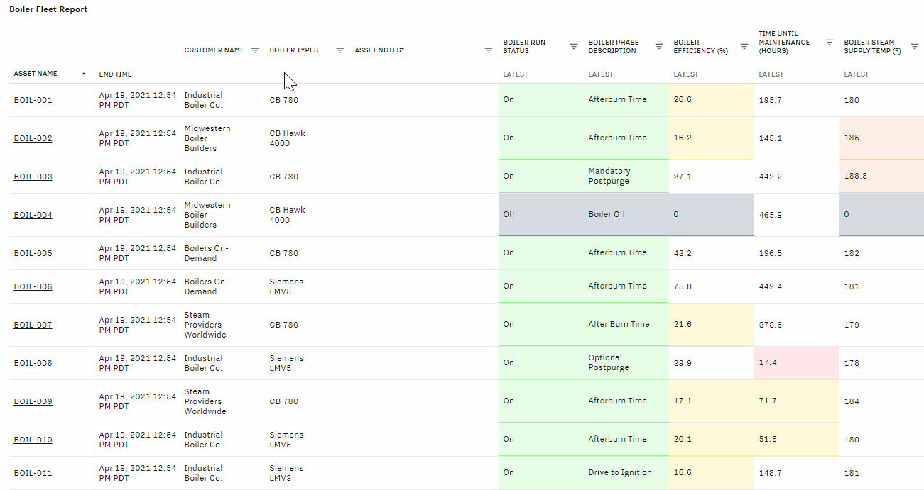
The operations overview dashboard is a customizable, real-time, interactive report that allows users to see an overview of their most critical equipment metrics. Many customers also use this as a hub that links out to more detailed analysis when needed.
The operations overview dashboard is created within a KPI dashboard and requires the use of data groups to populate the report with data and alarm templates for color-coding. Read on to learn how to set up and customize the dashboard.
Identify Maintenance Issues with the Operations Overview Dashboard
The Operations Overview Dashboard will provide a holistic overview to help you sift through data and alerts for multiple assets, regions, and job sites.

The dashboard is updated in real-time to provide you up-to-the-minute visibility:
Equipment metrics (with the ability to sort and filter)
Equipment details and asset notes (follow this article to set up)
Colors & alarm indicators
Gateway connectivity status and last reported time
You can begin troubleshooting equipment issues from the dashboard as well:
Select an “alarm bell” to navigate to the alarm incident page
Select a metric to further analyze the historical trend over time
Select an asset to view detailed equipment dashboards (follow this article to set up)
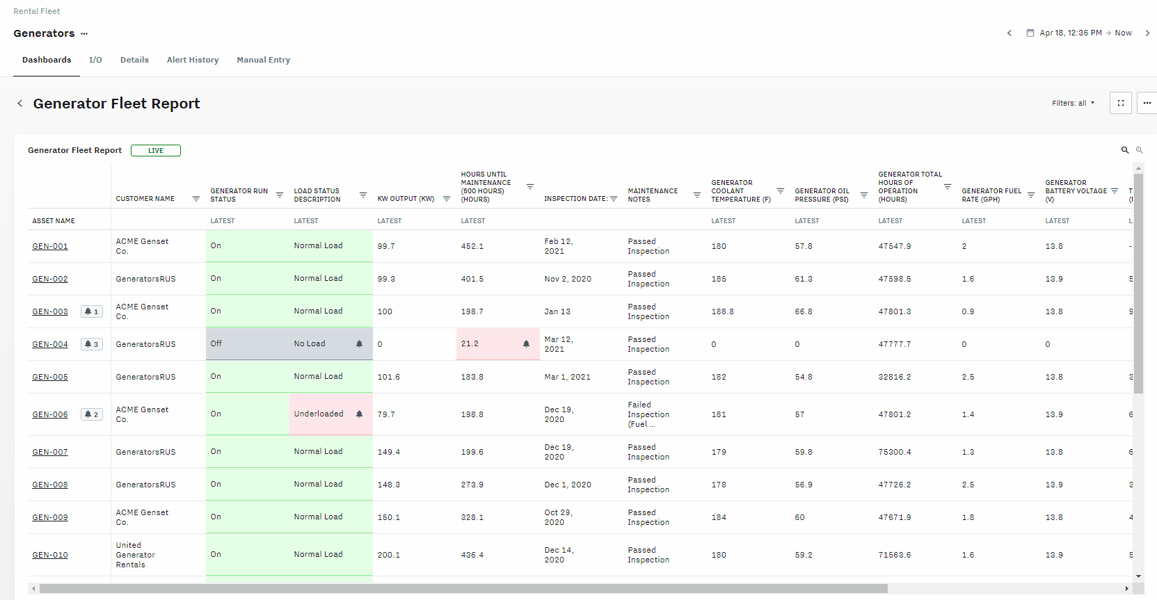
If you want to make changes to equipment details or asset notes, that can be made directly from the Overview dashboard.
Steps to Create Operations Overview Dashboards / Interactive Reports
Go to Settings → Dashboards → Create → KPI Dashboard
Drag and drop the Interactive Report from the Tables section
In the right sidebar, click ‘Edit Report Table’
Select your asset labels, assets, data groups and/or asset details to be displayed in the table.
You can also select a time interval, date range, and choose to report the latest, average, min, max, total, or last reported time to visualize data in different ways.
To customize the table further, you can click the three bars on the top right of the table preview to drag and drop the columns to reorder them.
Click ‘Run Report’ to see the preview updated, and click ‘Save Report Table’ to go back to the dashboard editing screen.
To customize the color coding on the table, click into the Advanced column in the right side bar. Here, you can select the column and the alarm you’d like to apply. You can create a new alarm template by clicking ‘Create” to open up the alarm template modal. Or you can select an existing alarm template (follow this article to set this up) and make any changes by clicking ‘Edit.’
Once you’re done, click save to exit the dashboard editing page.