Create SCADA / HMI Dashboards
Summary
KPI dashboards are customizable, real-time reports that allow users to view status and performance data from assets and processes.
With KPI dashboards, users can rapidly identify disruptions and inefficiencies. Users can also view historical data by selecting the appropriate date range.
Users can set up a KPI dashboard with a few simple steps that we will go through in this article.
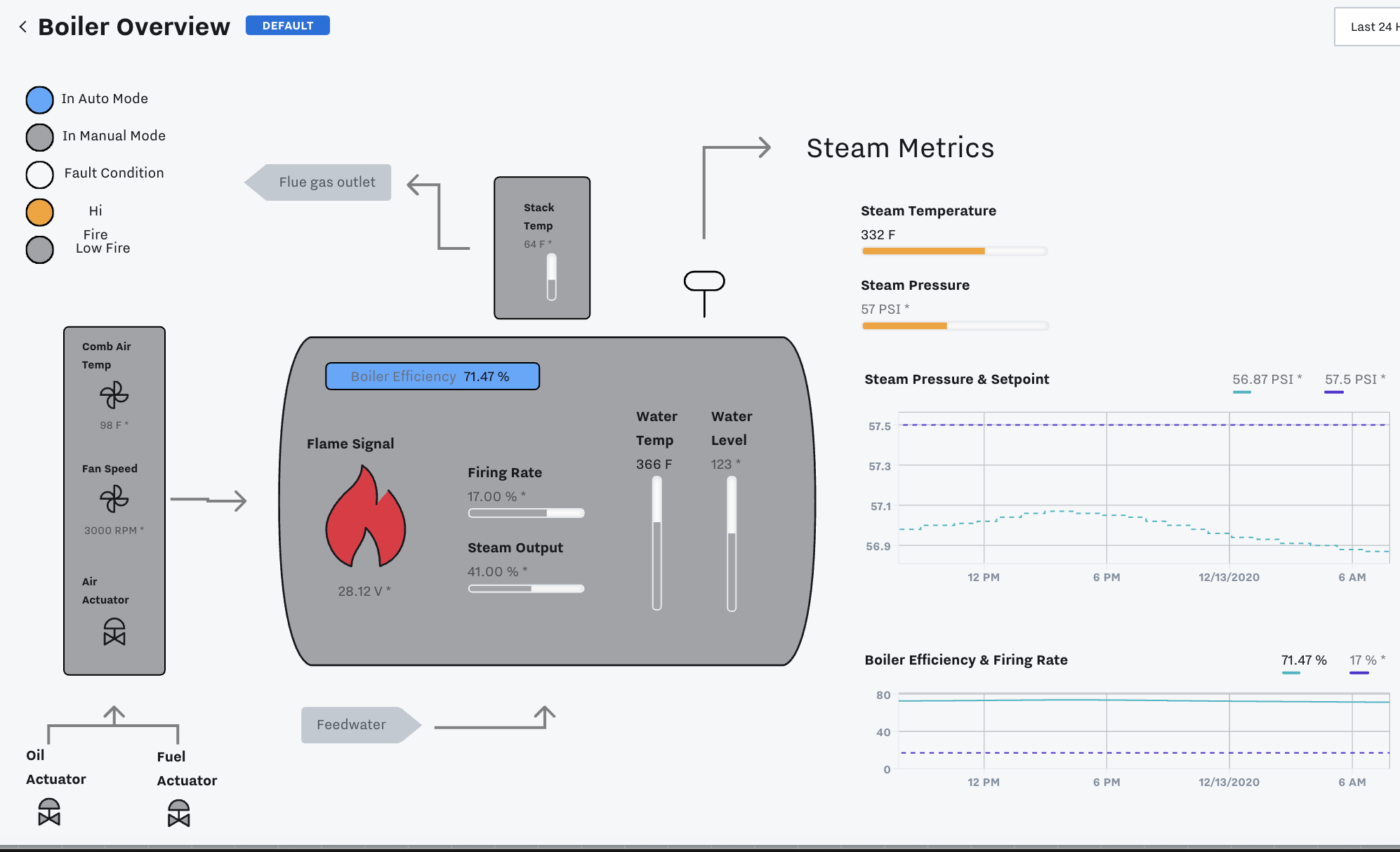
SCADA / HMI Dashboard Overview
Part 1 Video
Part 2 Video
Create a SCADA / HMI Dashboard
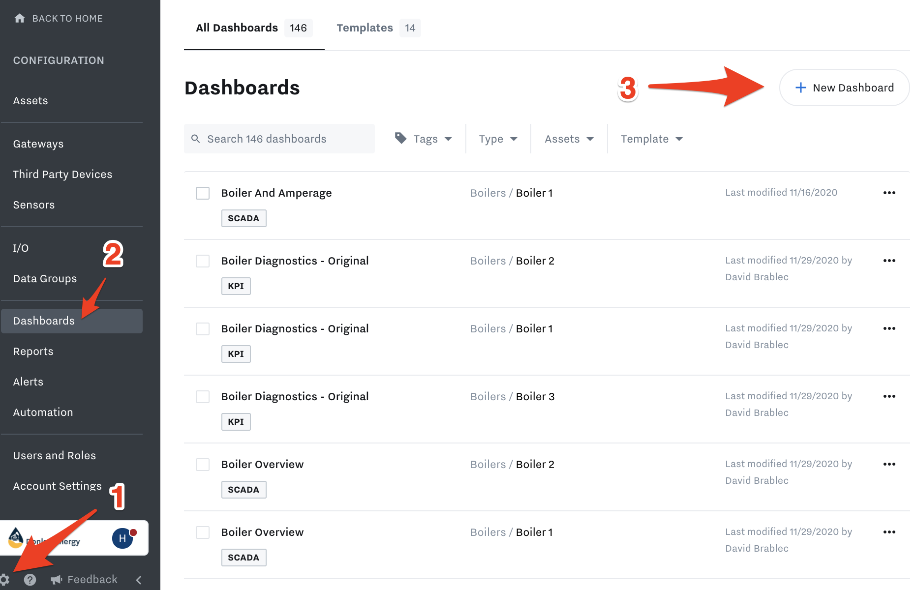
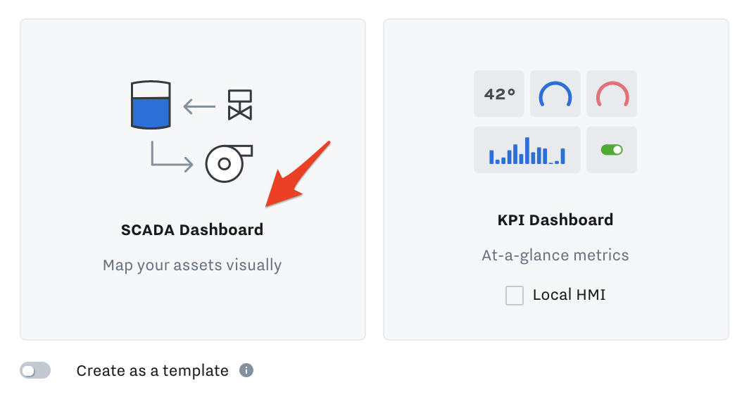
Go to Settings → Dashboards → New Dashboard → SCADA Dashboard
Select SCADA Dashboard
Navigate the top bar:
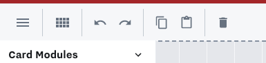
Within the top navigation you can undo, redo, copy, paste, delete, rename your dashboard, cancel (which will delete your progress) or save (which will save your progress).
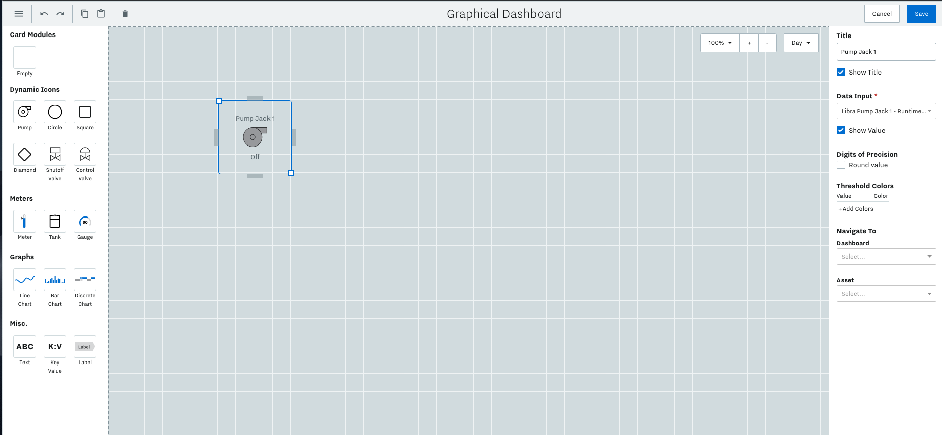
On the left you’ll see options for creating the dashboard. Drag and drop the icons onto the screen to arrange them according to your site. Once you have an icon in the dashboard, you can click into it to configure it and associate it with a data input.
Add and Configure Tiles
Tiles are all the boxes you can add to the dashboard:
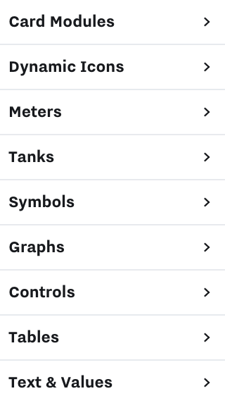
Below, we will go through each Tile type and how to add / use it on the SCADA dashboards.
Card Modules
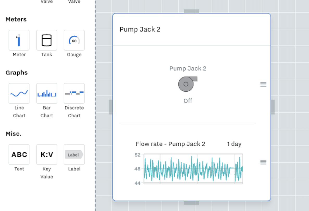
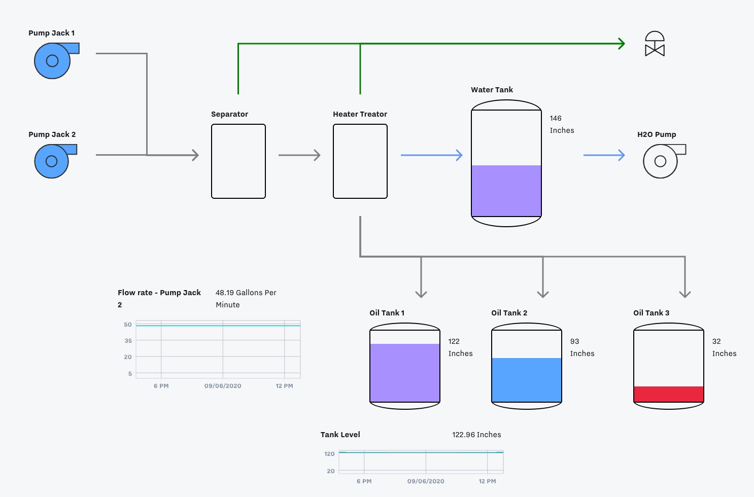
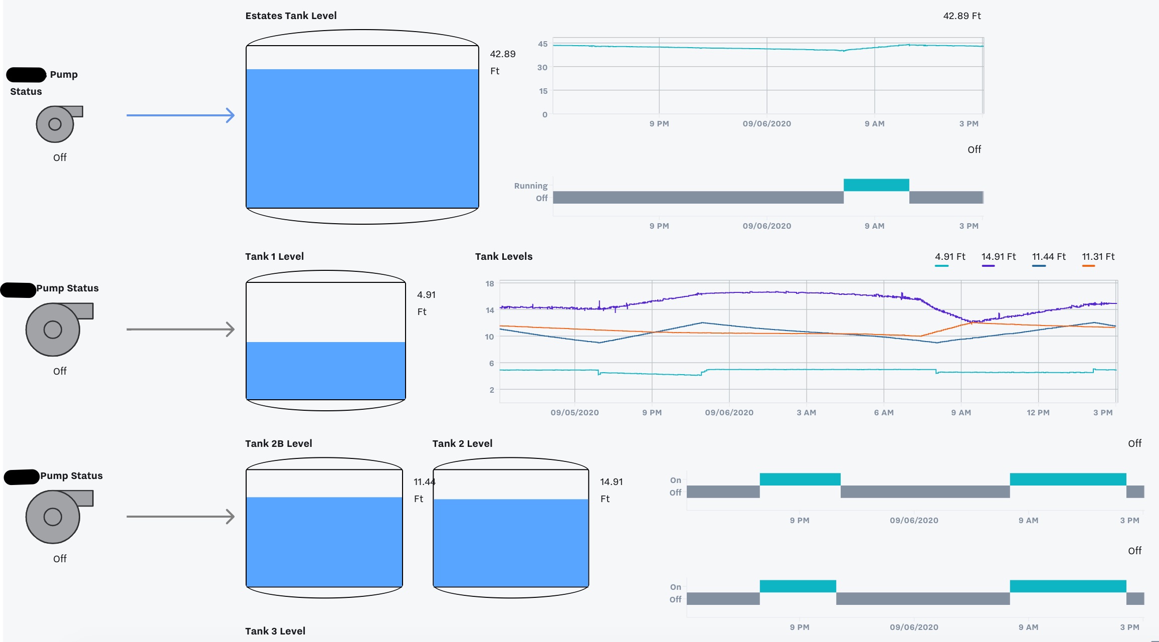
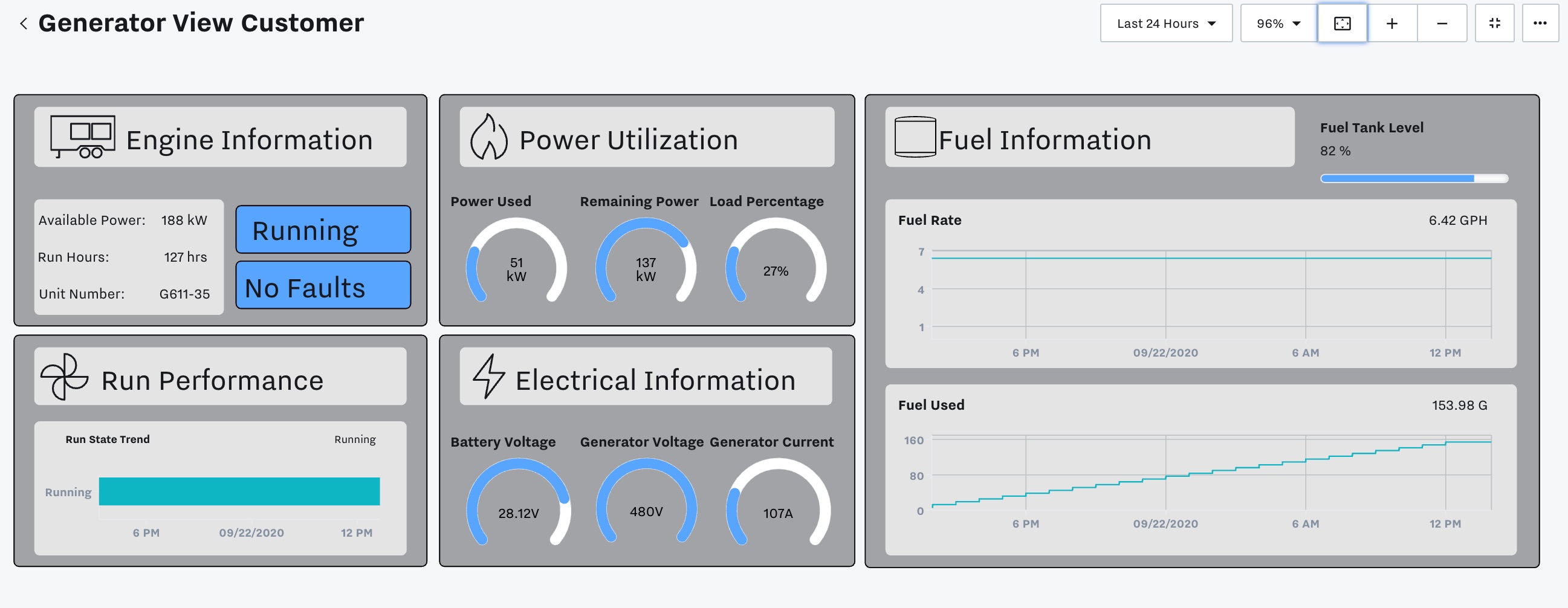
Card Modules allows you to group tiles together for better visualization. It may be helpful to group
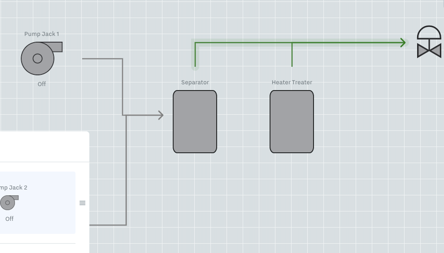
information together, e.g. Pump Jack 1 with a graph of the flow rate. You can use a card module for this. Drag and drop the card module into the dashboard, then drag and drop the pump icon into the empty card module. If you want the graph to show up below the pump icon, click “add row”, then drop the graph into the “add components” section.
Dynamic Icons
General
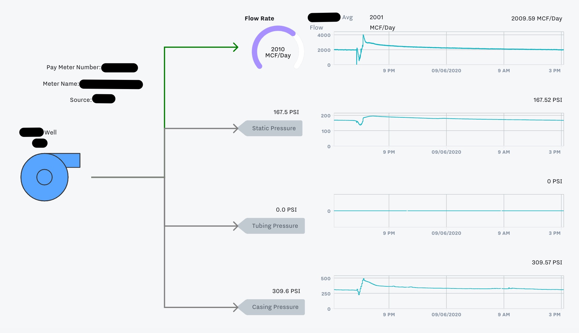
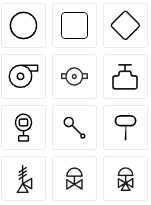
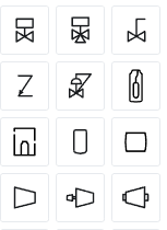
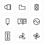
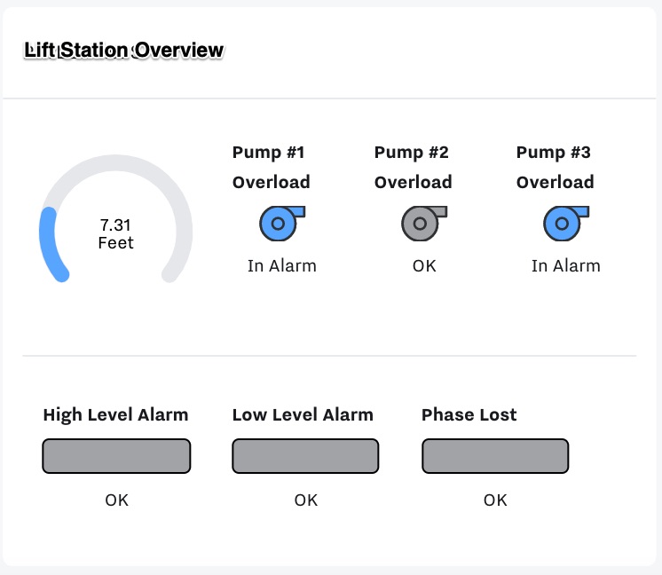
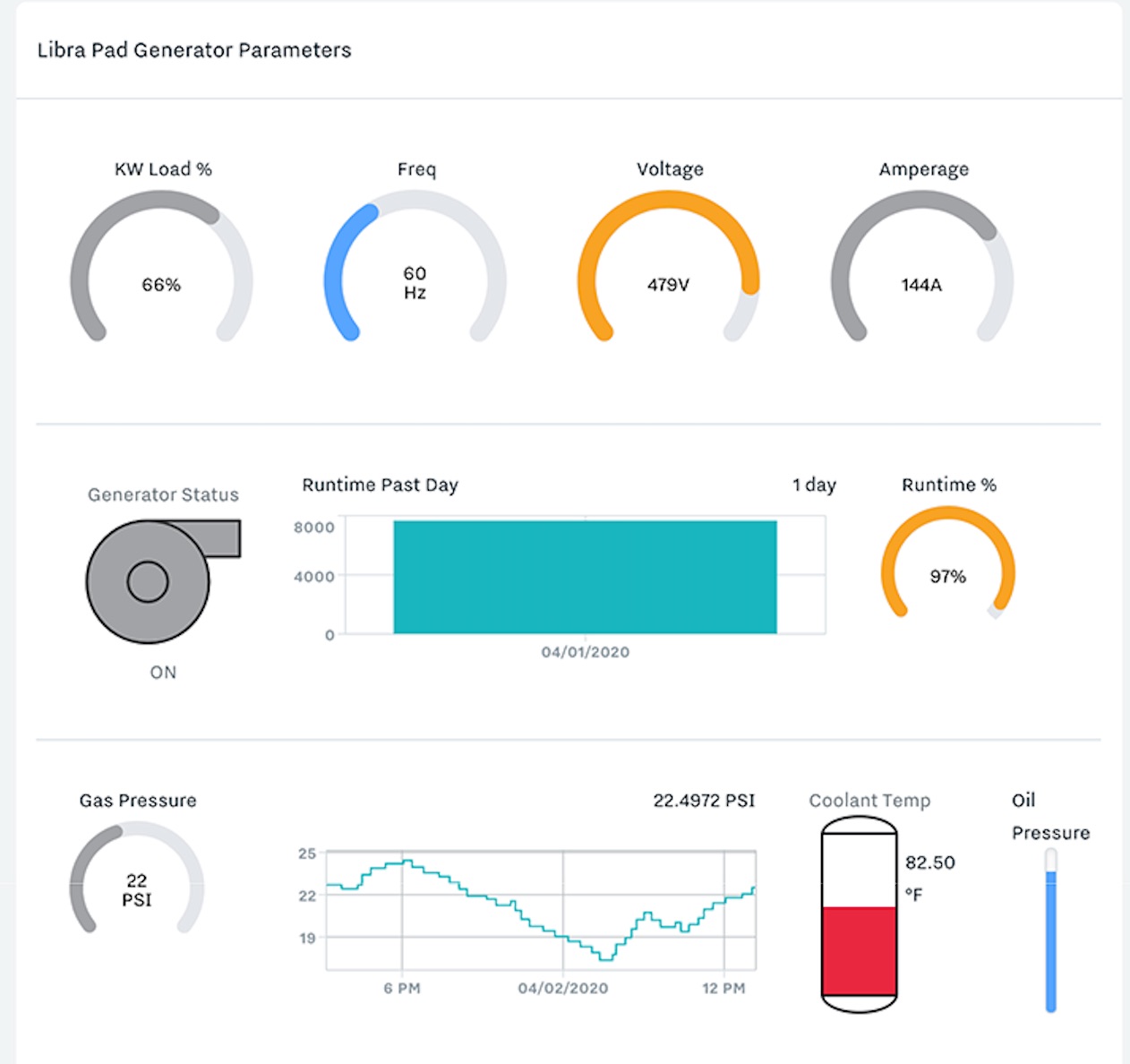
Add icons to show the symbols and actual values of your equipment, ie. pumps, generators, tanks. To see what each icon is, hover your mouse over the icon on the left sidebar.
 |  |  |
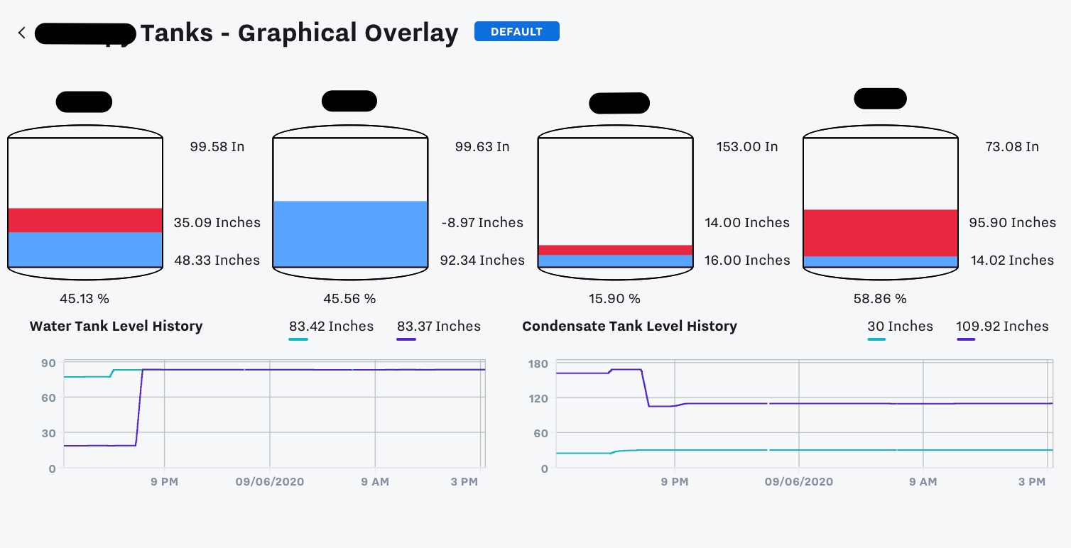
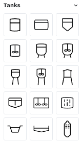
Tanks
Different types of tanks, ie. filtration, digester, sedimentation basin, clarifier, water purifier, etc.
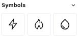
Symbols
Different symbols for type of value, ie. electricity, fire/heat, water.
Lines
Once you have multiple icons you can connect them with lines. When you hover over an icon you’ll see four gray bars on each side. Click and hold down from one gray bar to another gray bar to create an arrowed line between them. For example, you can draw a line connecting Pump Jack 1 and Pump Jack 2 to the Separator icon. Click into a line to configure the color and whether or not it has an arrow.
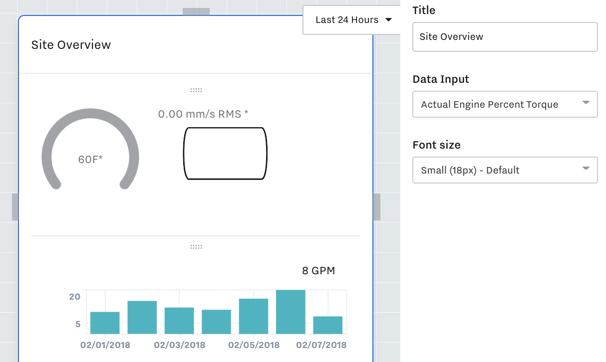
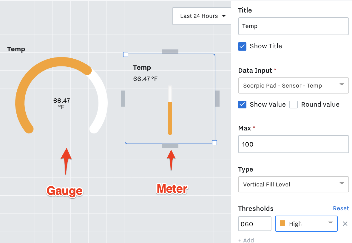
Meters
You can use a meter icon to display values in relation to maximums that you set. For example, you can create a tank associated with a data input for tank level. Drag and drop a tank in, create a title, select a data input, and set a maximum. This maximum will determine the virtual tank fill level based on its current value, e.g. if the maximum is 200 and the tank level is currently at 100, it will look half full. You can also add numeric thresholds that will change the color of the tank fill, e.g. red for critical, orange for high, purple for medium, blue for low, or simply set to standard gray.
Gauge and Meters
Used to show a color value relative to its' low and/or high threshold alarms.
To set up thresholds linked to configured alerts, select “Use existing data input alerts.” This way, the dashboard will change if you update the alert thresholds in the Samsara Cloud.
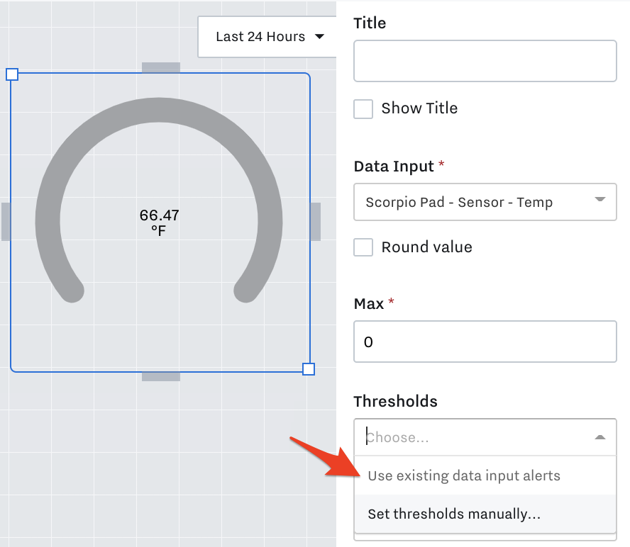
To set the thresholds manually so they are not tied to configured alerts, select that manual option. We outline that here: Create KPI Dashboards .
Graphs
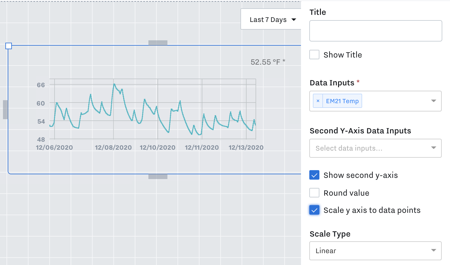
You can also create a graph for visualizing data, e.g. the flow rate of Pump Jack 1. Drag and drop a line chart into the dashboard, give it a title, select a data input, and scale the Y axis if needed. If you’ve created an additional dashboard that provides more details into the operations of a specific asset or process, you can link out to it by selecting one within the “Navigate to” drop down.
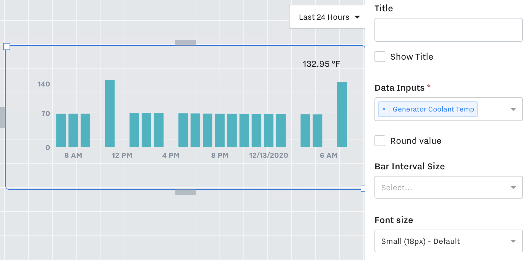
Summary Bar Graph
Summary Bar Graphs show values based on a set time interval. Ex: By day or hour.
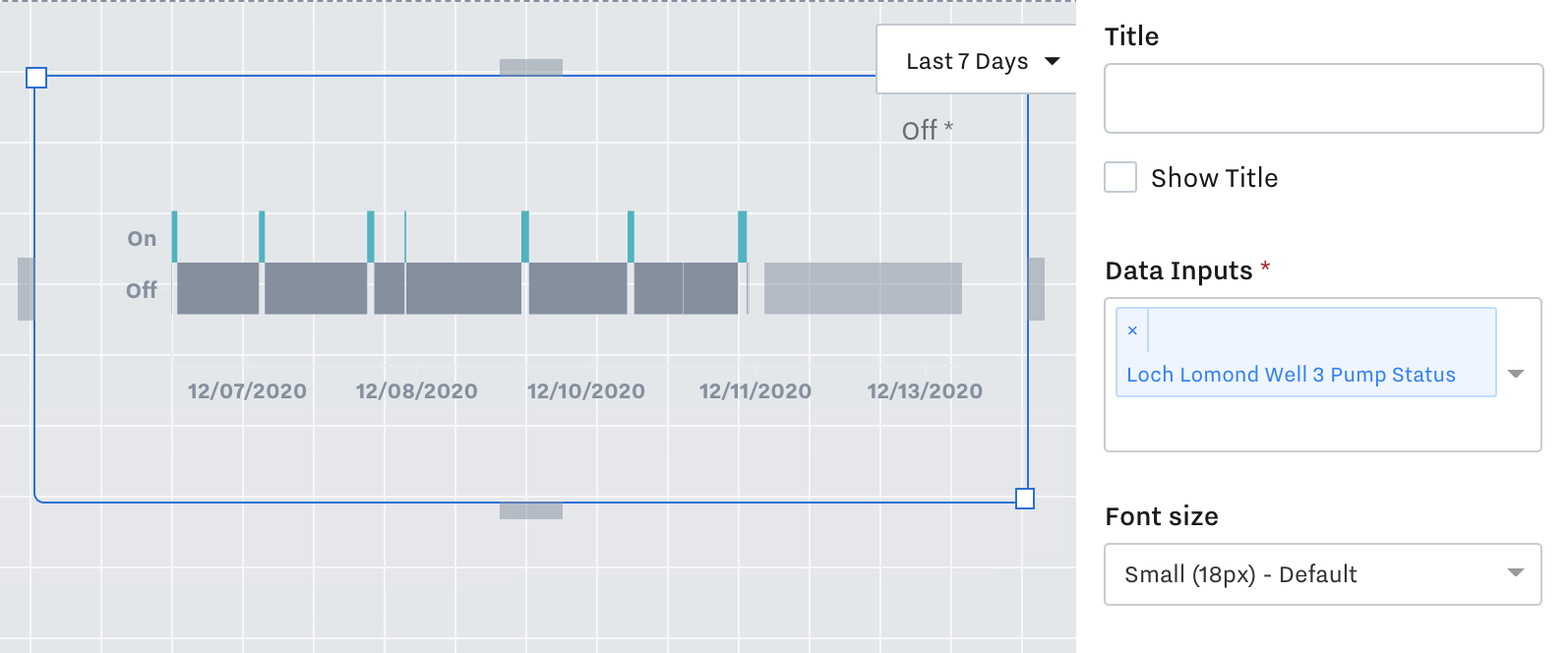
Time Series Bar Graph
Time Series Bar Graphs show the Text value of input(s) over time. Ex: On/Off or Running/Not Running or In Alarm / Not in Alarm.
Time Series Line Graph
Time Series Line Graphs show the Actual value of input(s) over time. Ex: Temp, Pressure, Humidity.
Controls
Button, Slider, Toggle
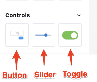
See our Control article: Set up Dashboard Control Components
Tables
You can add tables to visualize data in table format:
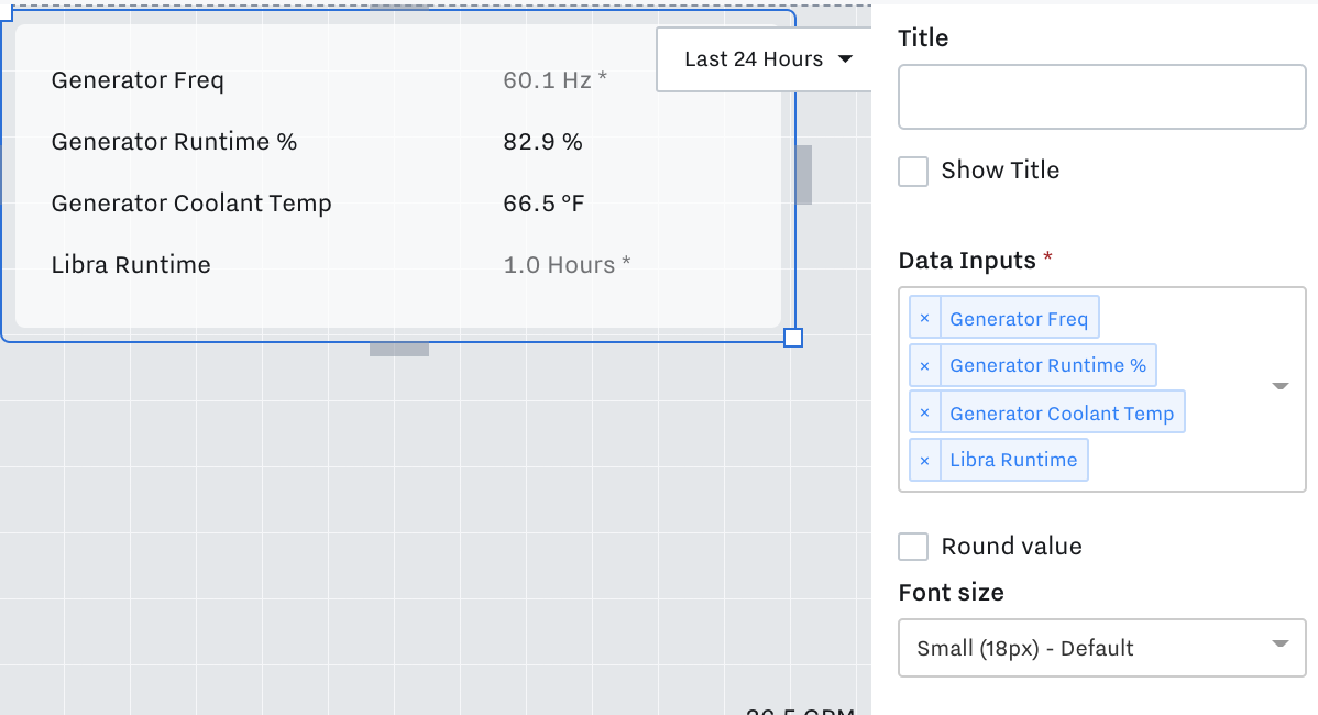
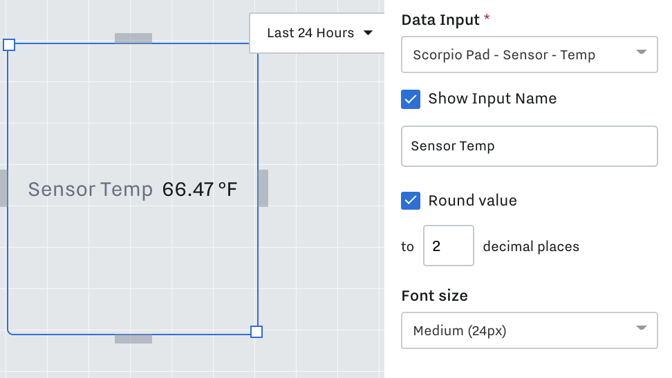
Text and Values
Key Value
Single value tiles show an input’s current value.
Text Value
Text value tile lets you write in custom text to display on dashboards. For example, instructions to the dashboard users or notes.
Use inside Card Modules to create better looking modules. Example below:
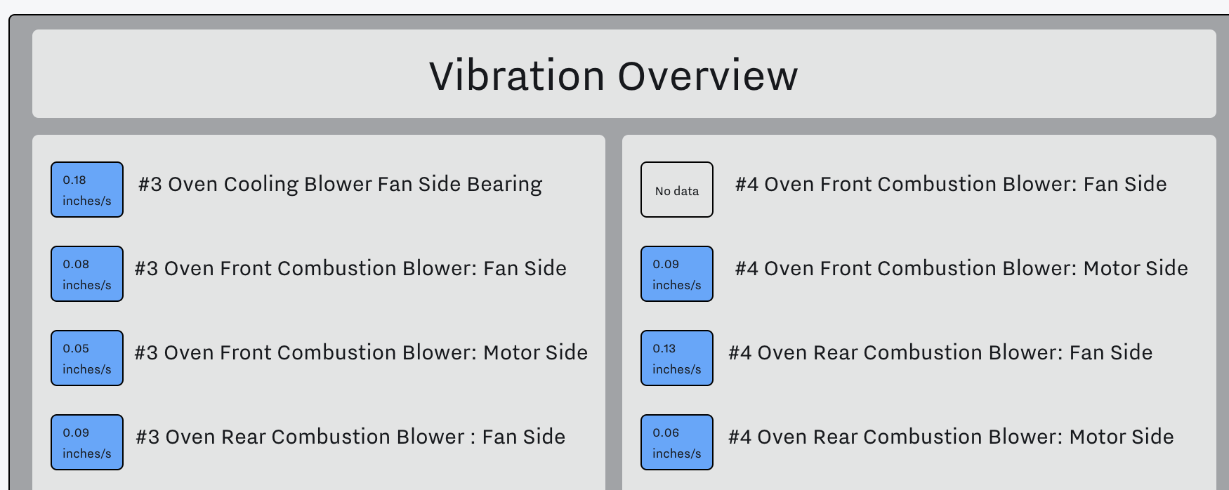
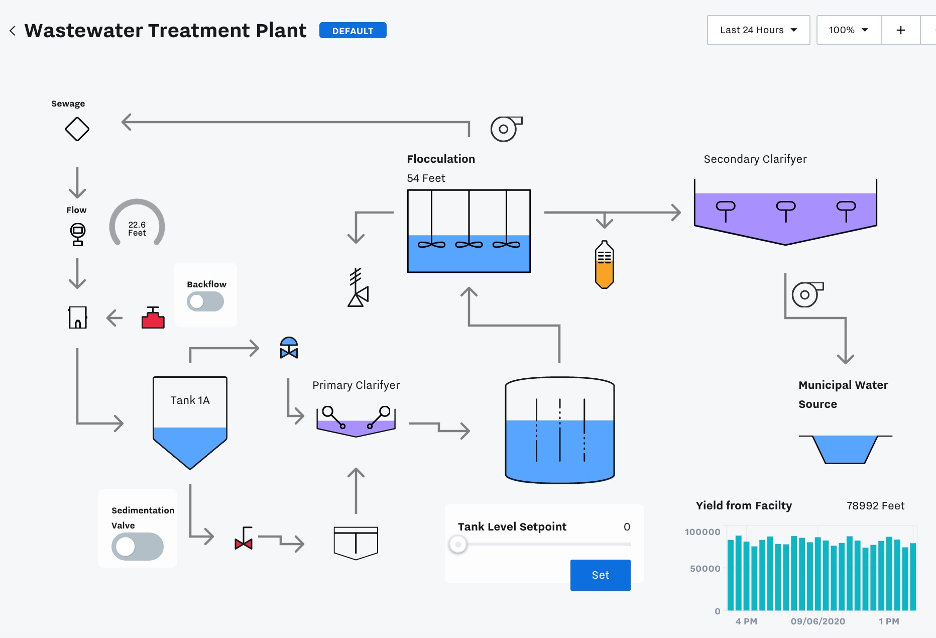
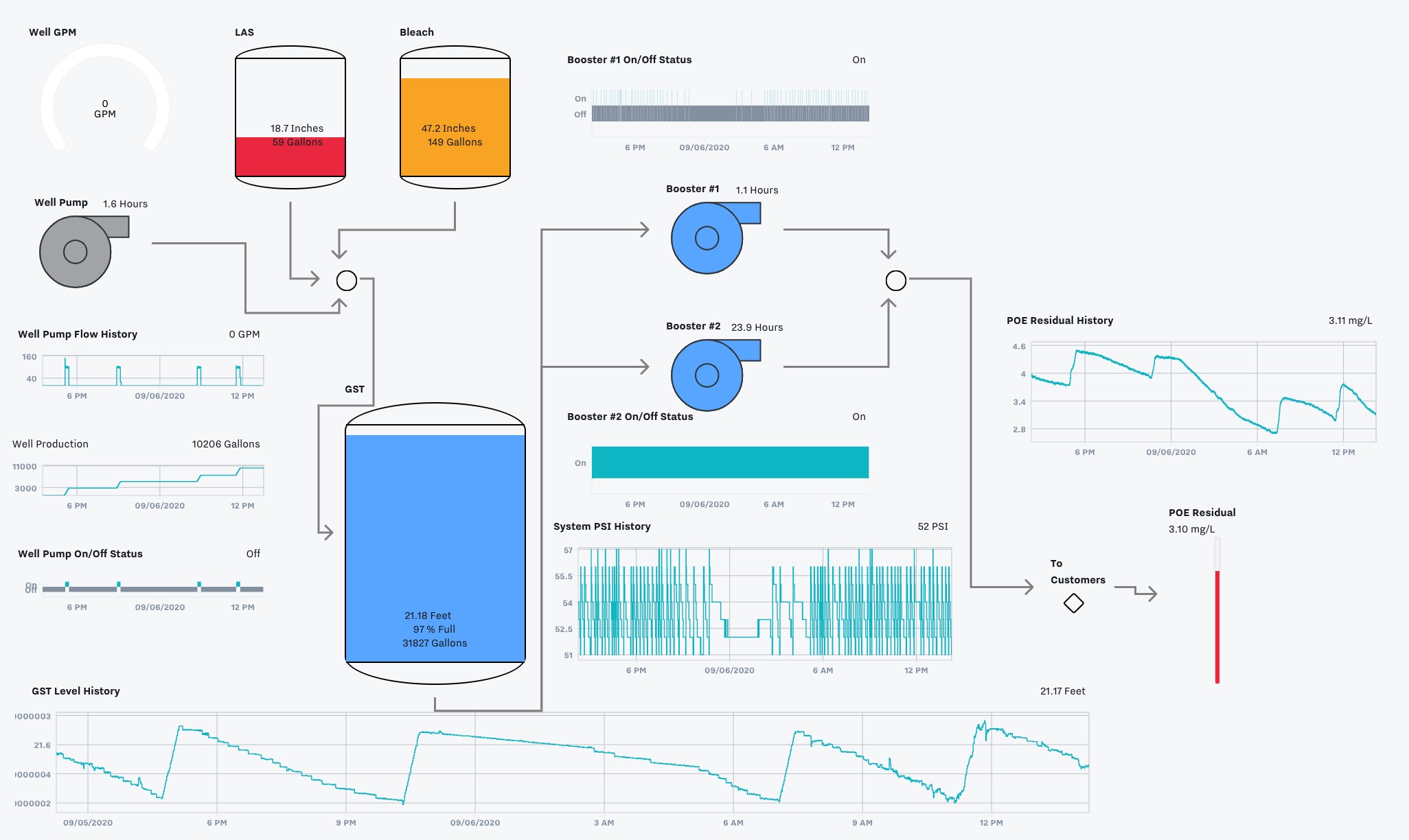
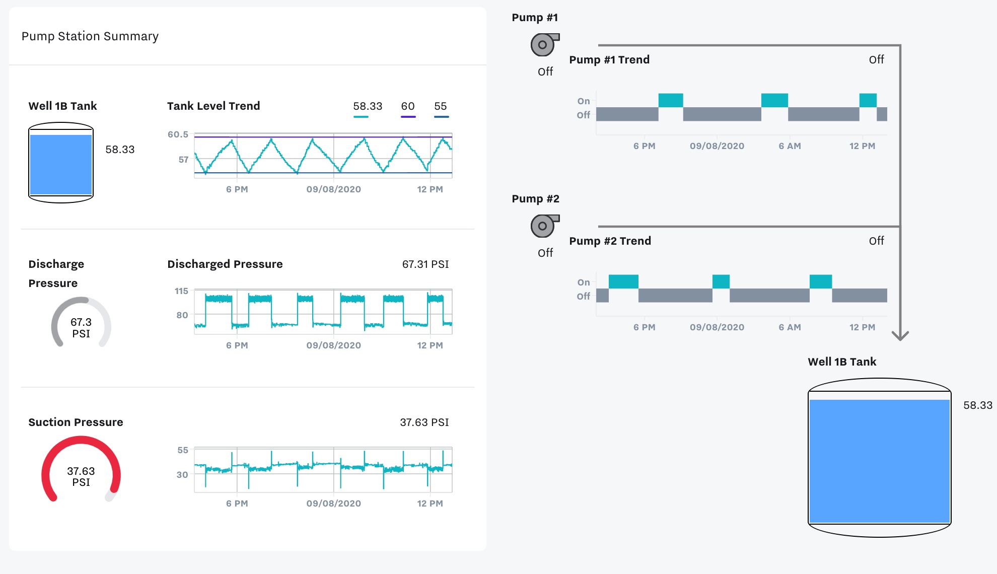
Example SCADA Dashboards
Water / Wastewater
Rentals / OEM / EaaS
Generators
Boilers
Oil & Gas