Create KPI Dashboards
Summary
KPI dashboards are customizable, real-time reports that allow users to view status and performance data from assets and processes.
With KPI dashboards, users can rapidly identify disruptions and inefficiencies. Users can also view historical data by selecting the appropriate date range.
Users can set up a KPI dashboard with a few simple steps that we will go through in this article.
KPI Dashboard Overview
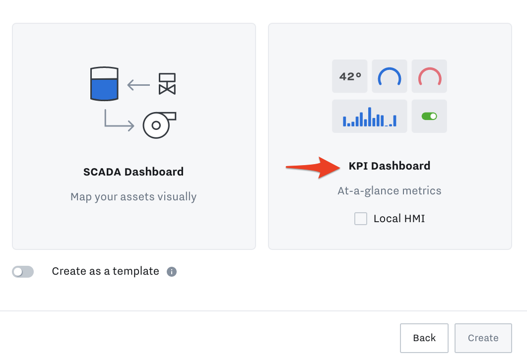
Create a KPI Dashboard
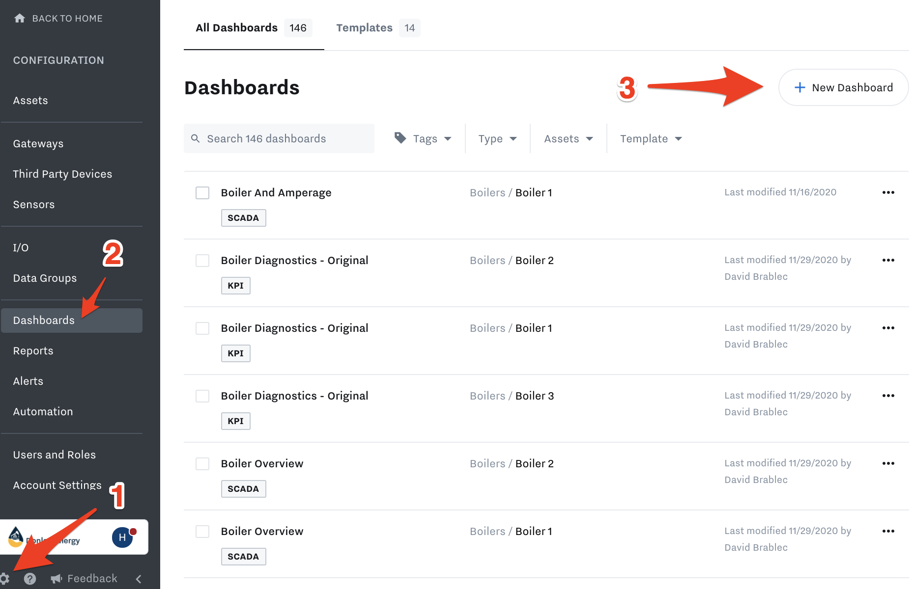
Go to Settings → Dashboards → Create → KPI Dashboard
Add and Configure Tiles
Tiles are all the boxes you can add to the dashboard:
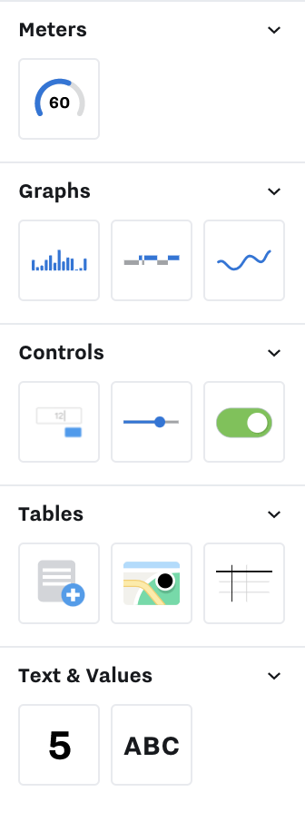
Meter
Gauge
Graphs
Summary Bar Graph
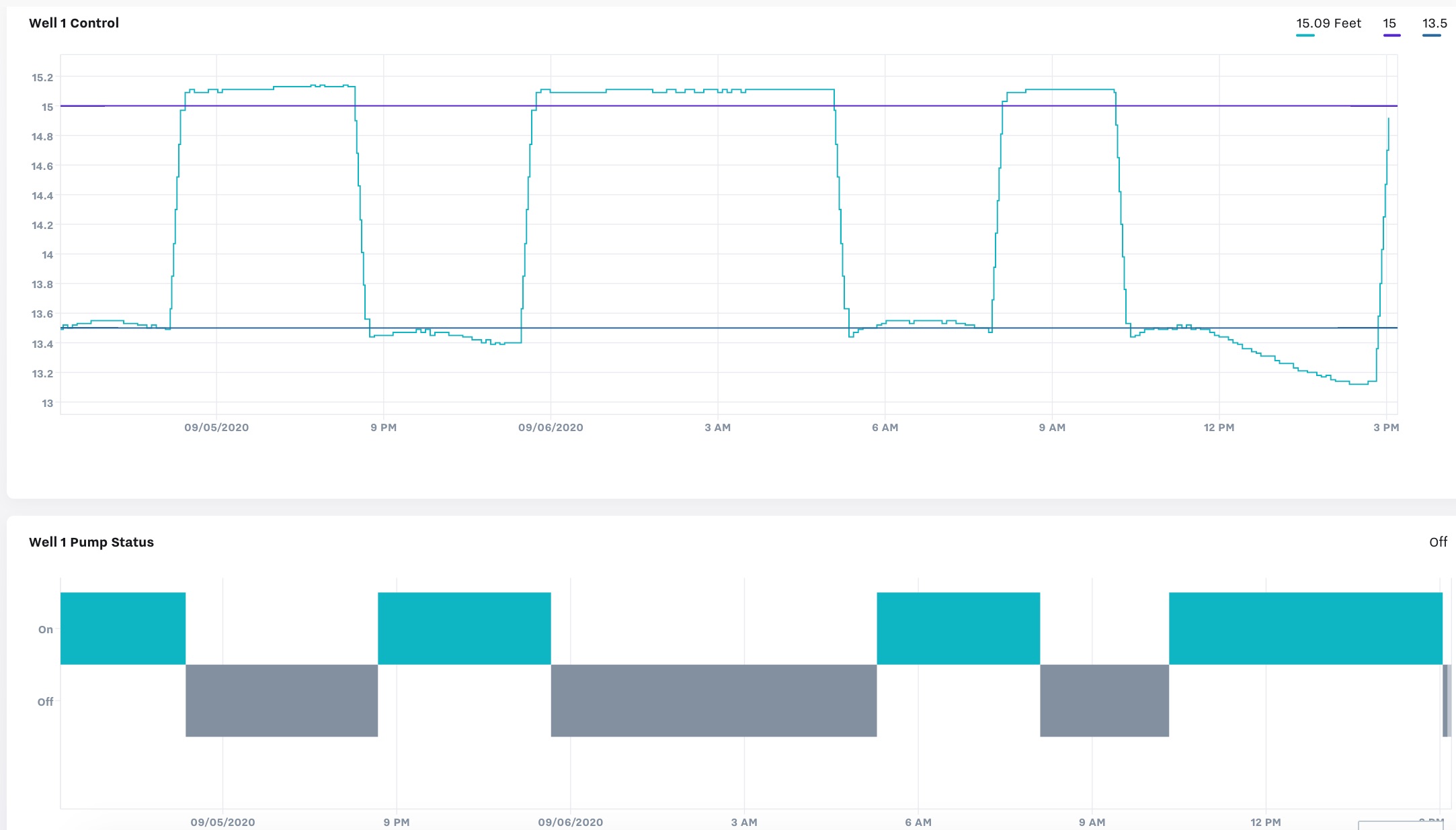
Time-Series Bar Graph
Time-Series Line Graph
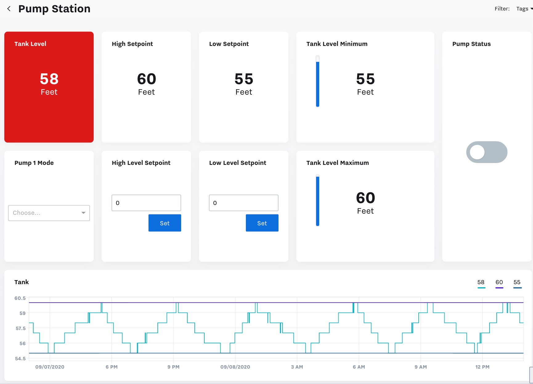
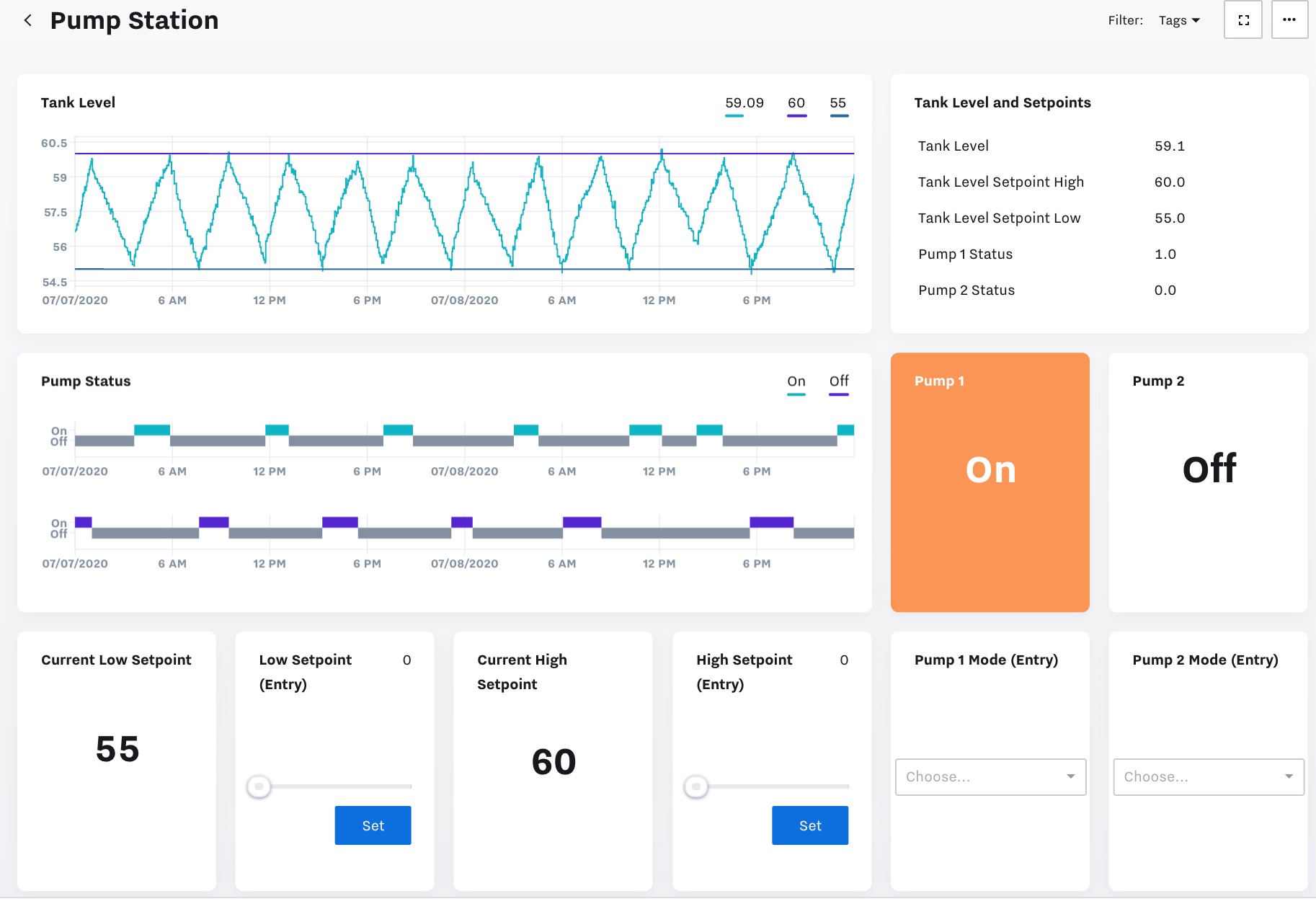
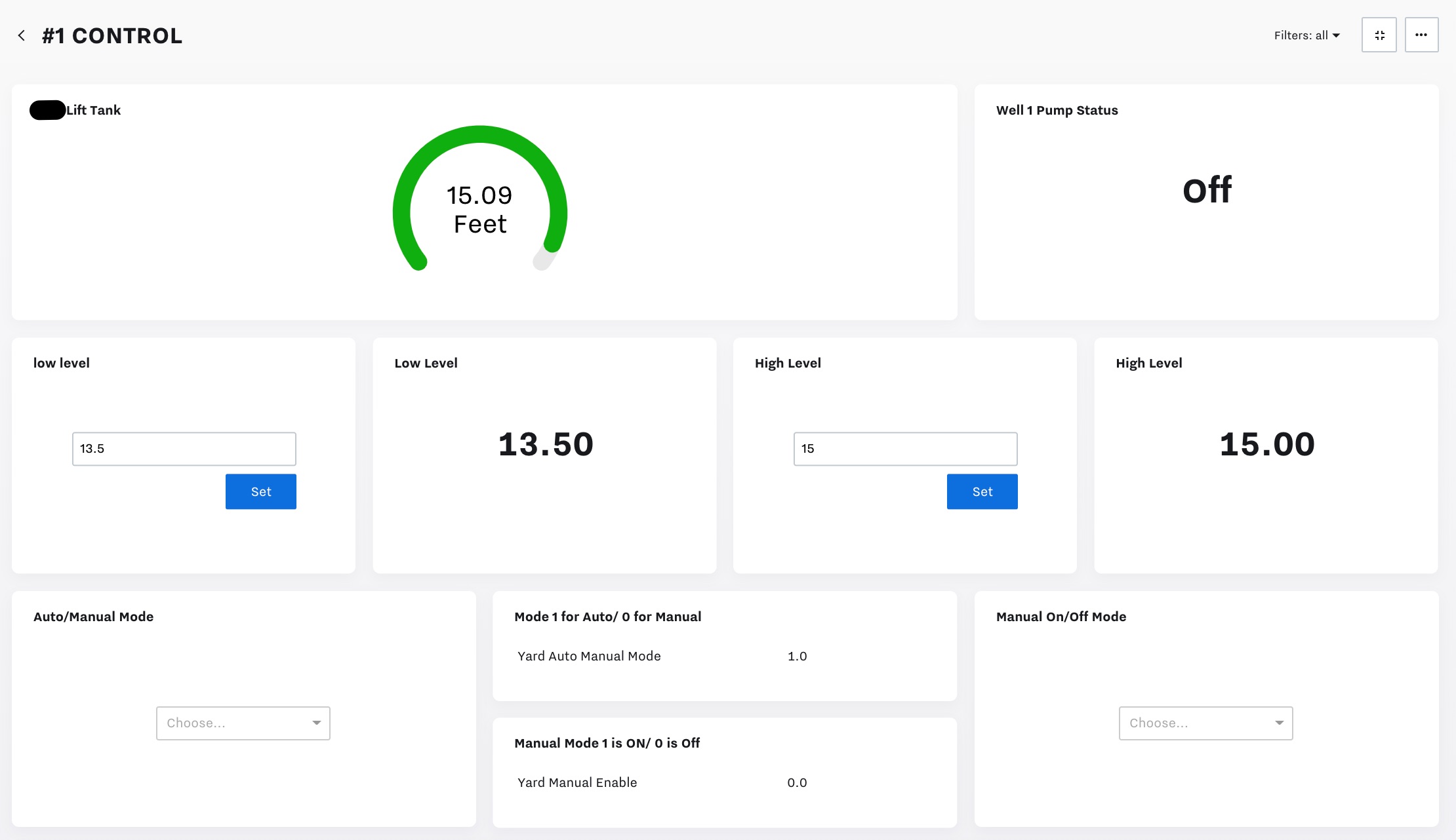
Control (Set up Dashboard Entry Tiles )
Button
Slider
Toggle
Tables
Embedded Report
Interactive Report
Map
Table
Text & Values
Single Value
Text
Tile Type | Description and Example |
|---|---|
Gauge | Gauges are used to show a color value relative to its' low and/or high threshold alarms (not linked to actual alarms set up in the Cloud).  |
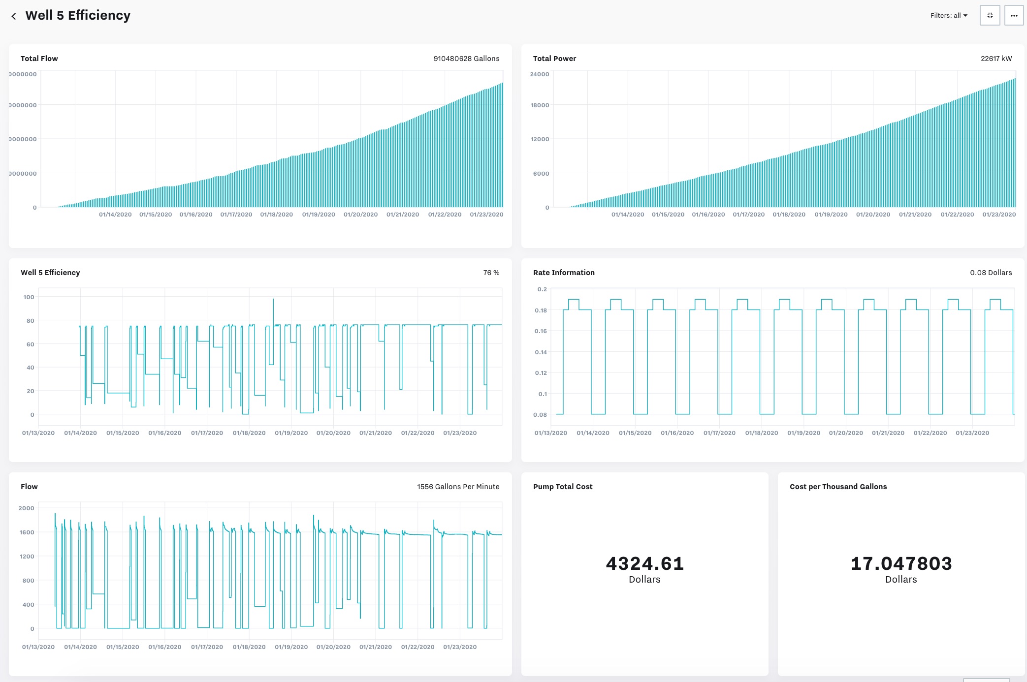
Summary Bar Graph | Summary Bar Graphs show values based on a set time interval. Ex: By day or hour.  |
Time Series Bar Graph | Time Series Bar Graphs show the Text value of input(s) over time. Ex: On/Off or Running/Not Running or In Alarm / Not in Alarm.  |
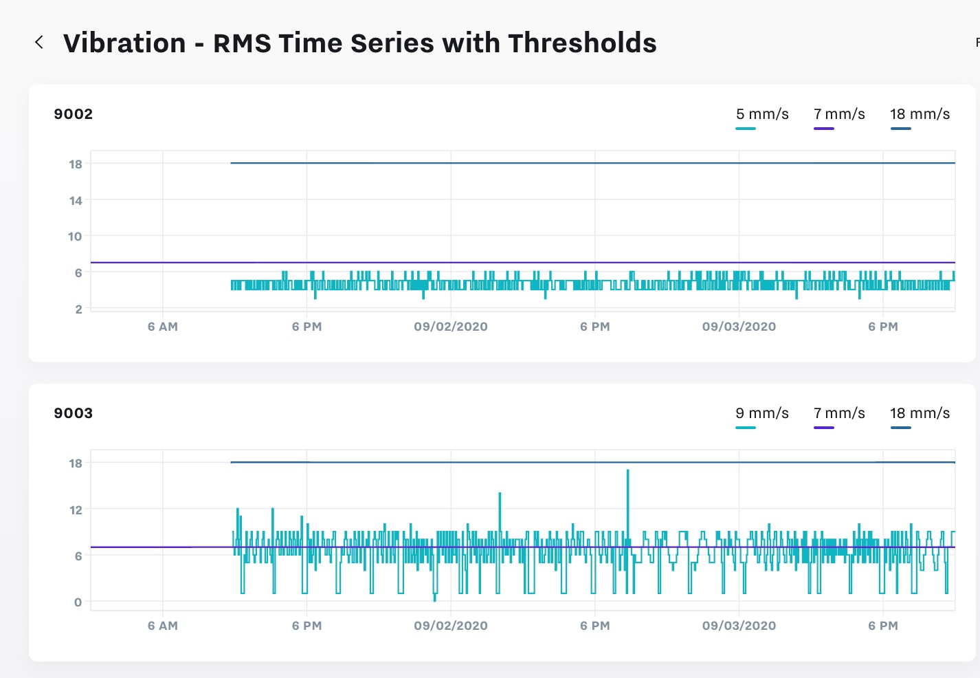
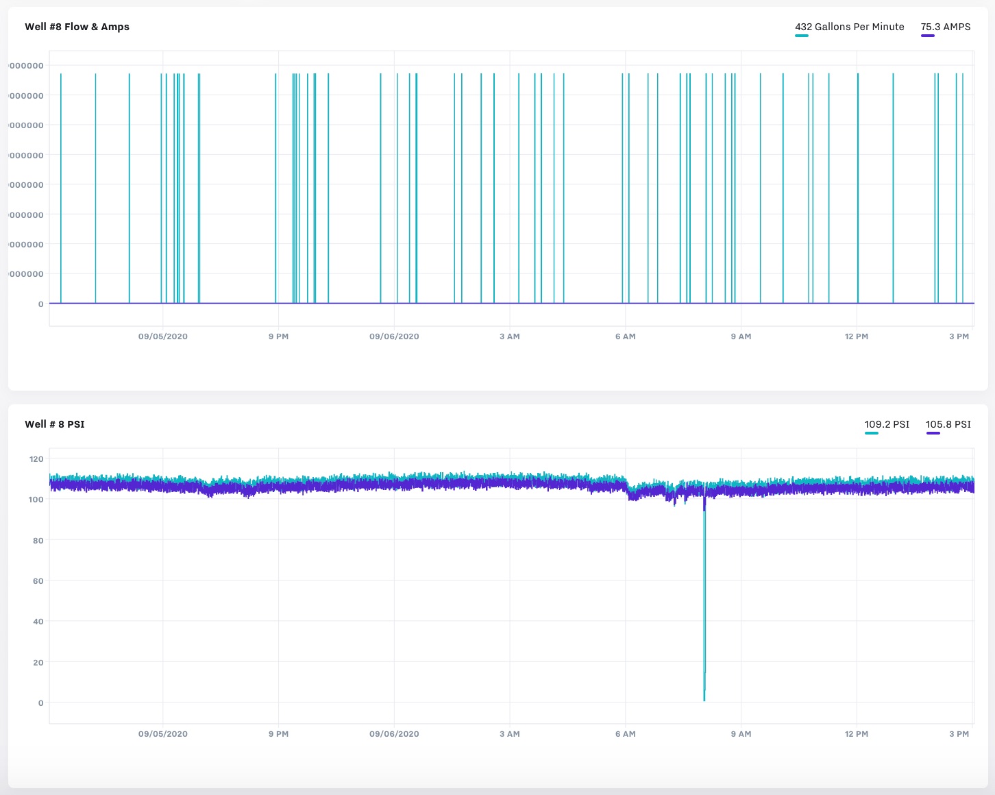
Time Series Line Graph | Time Series Line Graphs show the Actual value of input(s) over time. Ex: Temp, Pressure, Humidity.  |
Button, Slider, Toggle | See our Control article: Set up Dashboard Entry Tiles 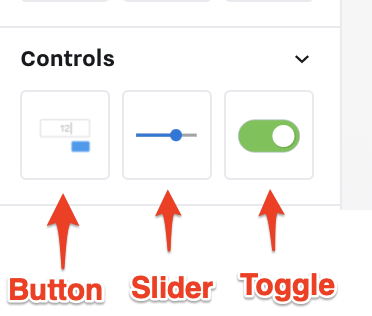 |
Embedded Report | Once you set up Reports, you can add it to dashboards. See our Reports chapter: Set up Reports 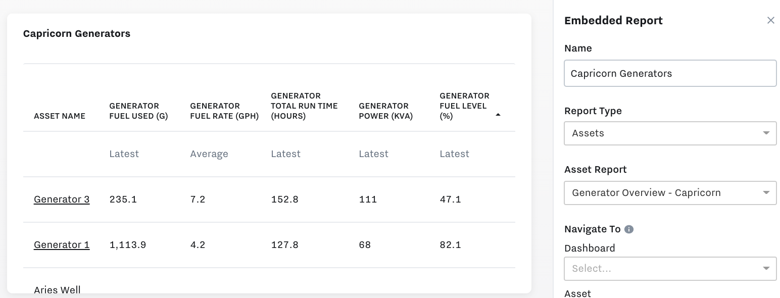 |
Interactive Report | An interactive report can be used to create operations overview dashboards, an interactive, real-time view into the critical metrics that are actionable for your business. Learn more in this article: Create Operations Overview Dashboards / Interactive Reports 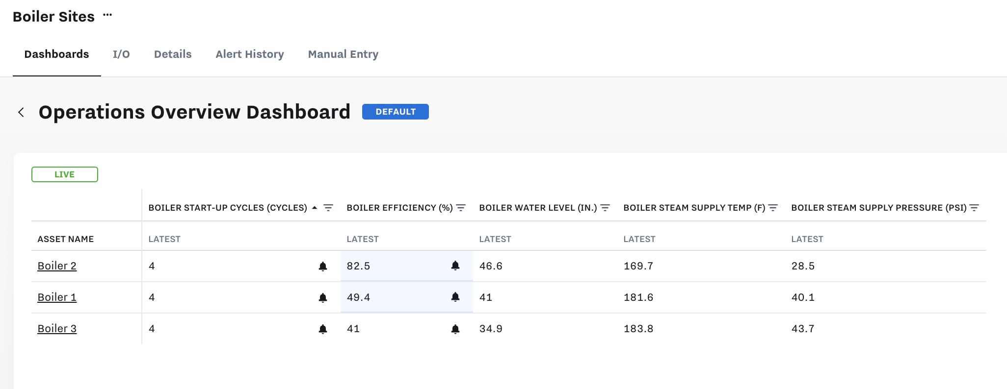  |
Map | Once you set up lat/long coordinates for Assets in Asset Details, you can visualize the Map view in Dashboards: Set up Assets with the Asset Tree and Asset Labels 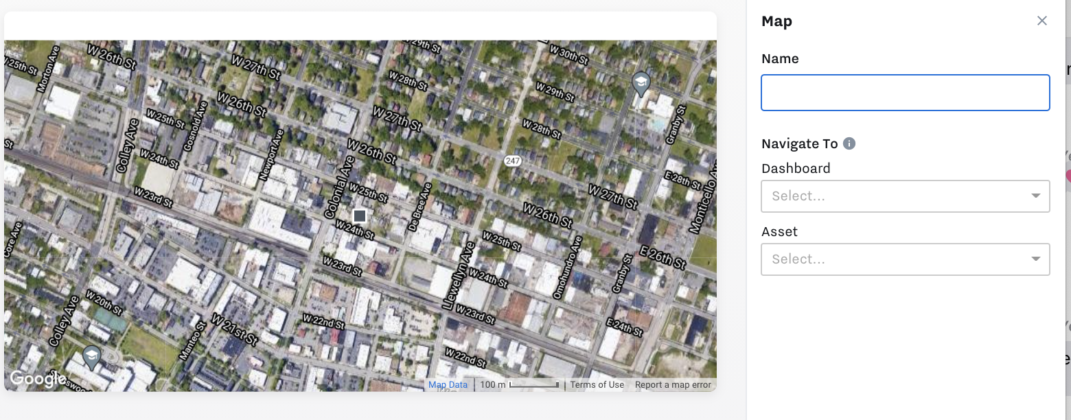 |
Table | You can add tables to visualize data in table format:  |
Single Value | Single value tiles show an input’s current value. 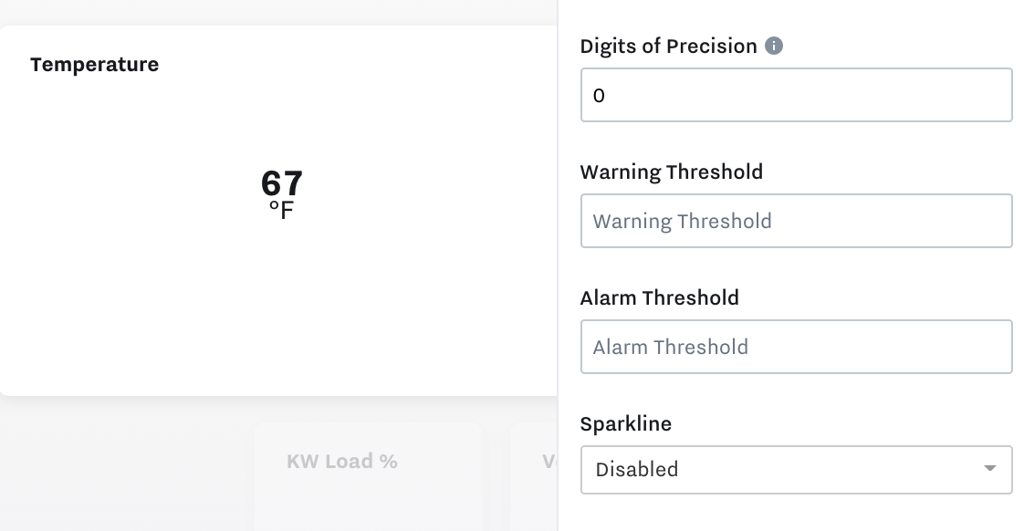 Warning / Alert Threshold Colors You can set color thresholds (not tied to actual alerts configured). Orange means warning 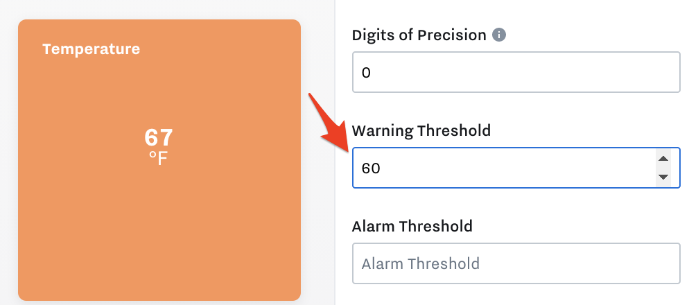 Red means in alarm 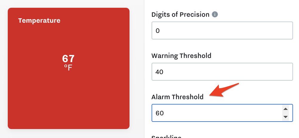 Sparkline
 Meter with Thresholds To add a meter with color thresholds on the Single Value tile, select the Max Value: 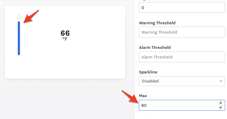 |
Text Value | Text value tile lets you write in custom text to display on dashboards. For example, instructions to the dashboard users or notes. 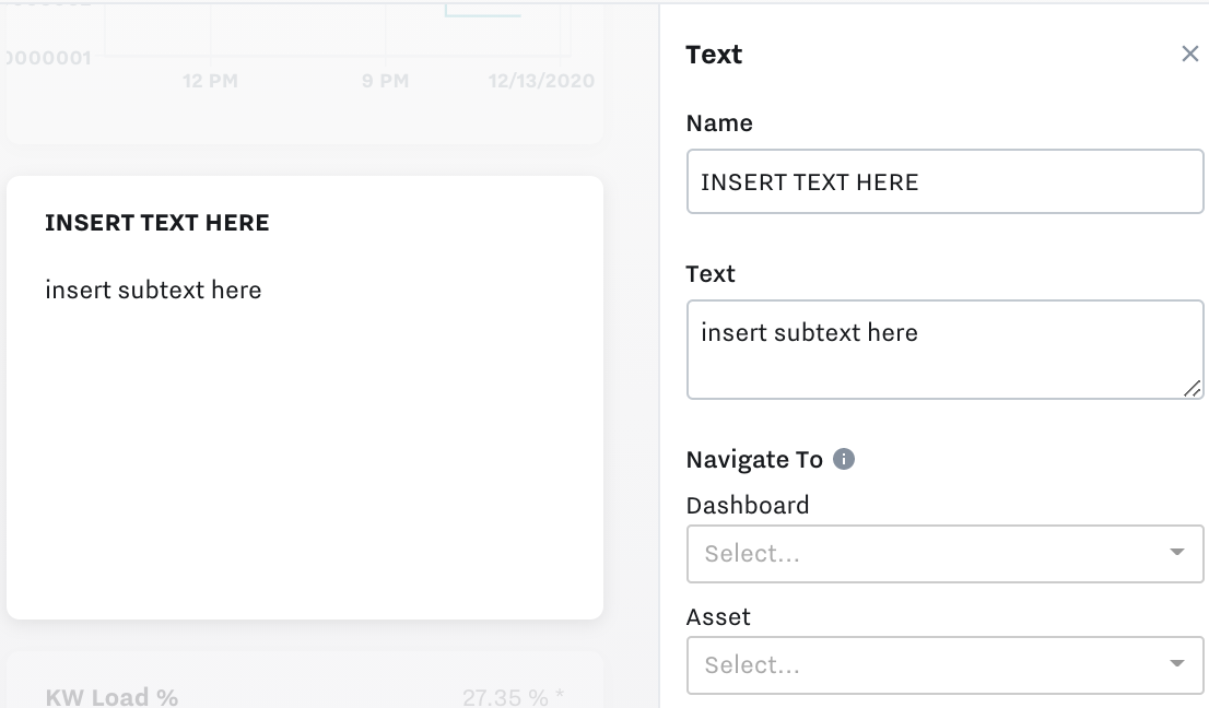 |
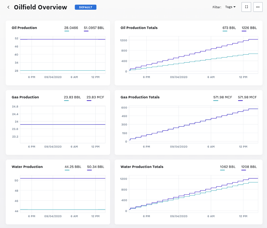
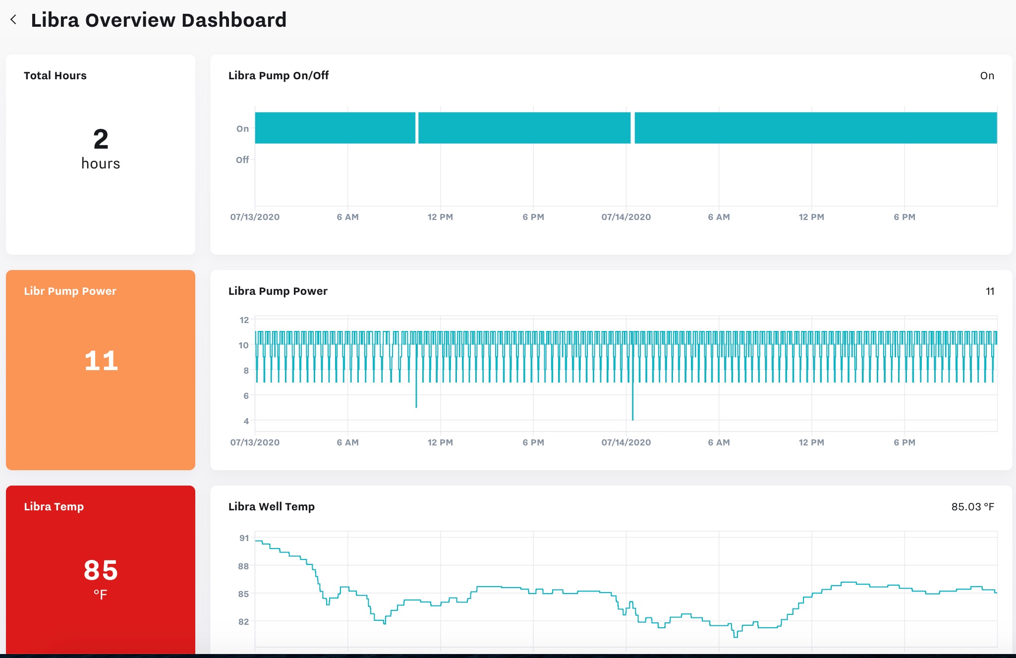
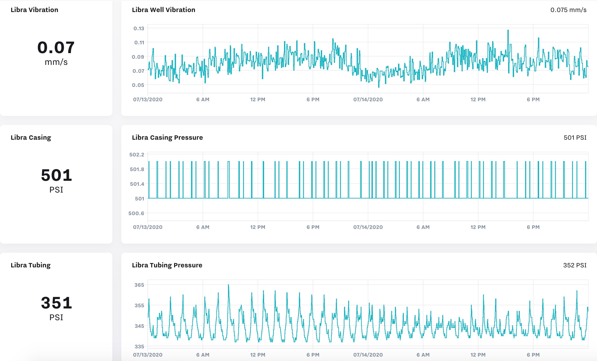
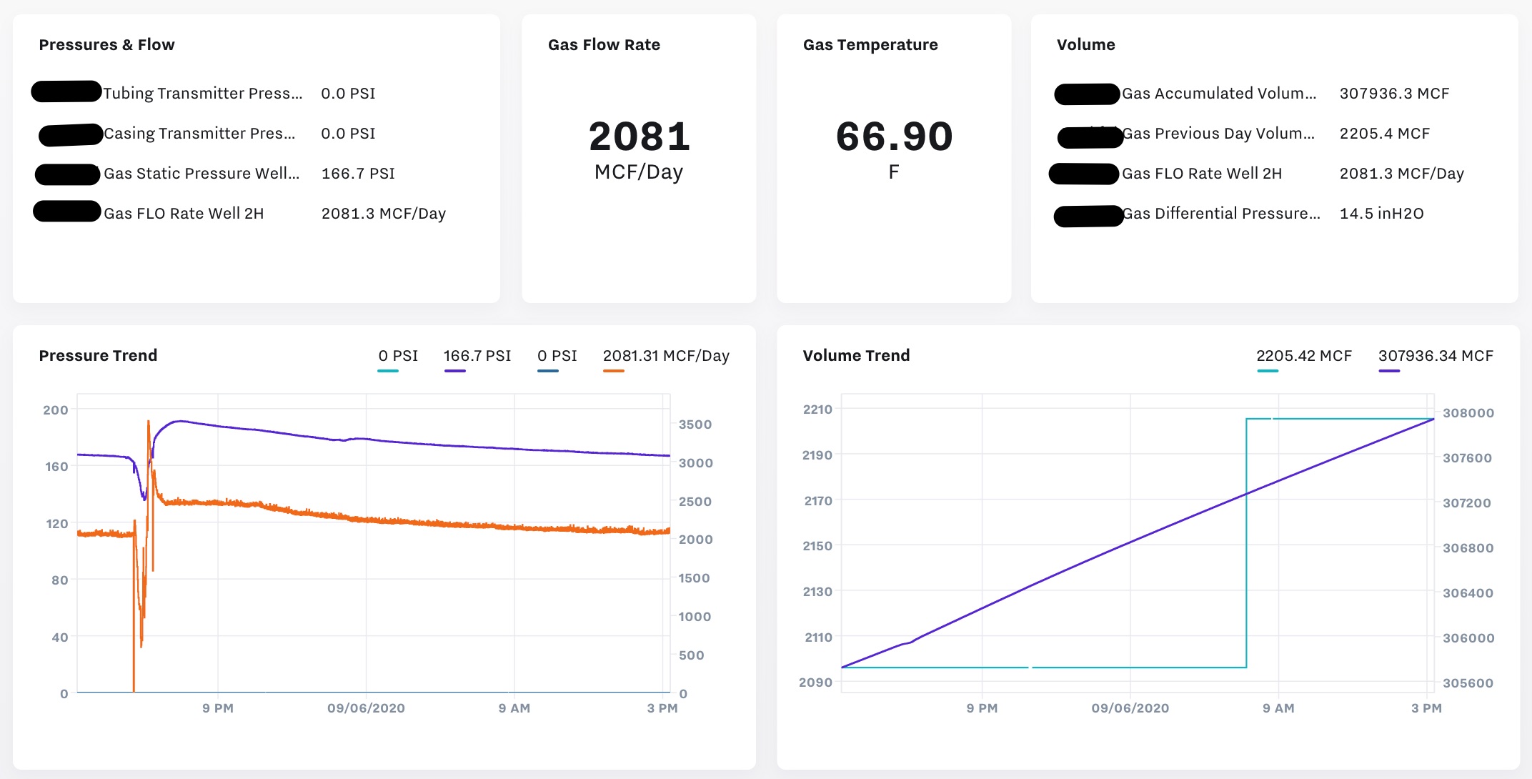
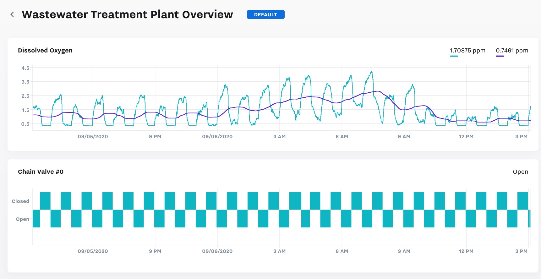
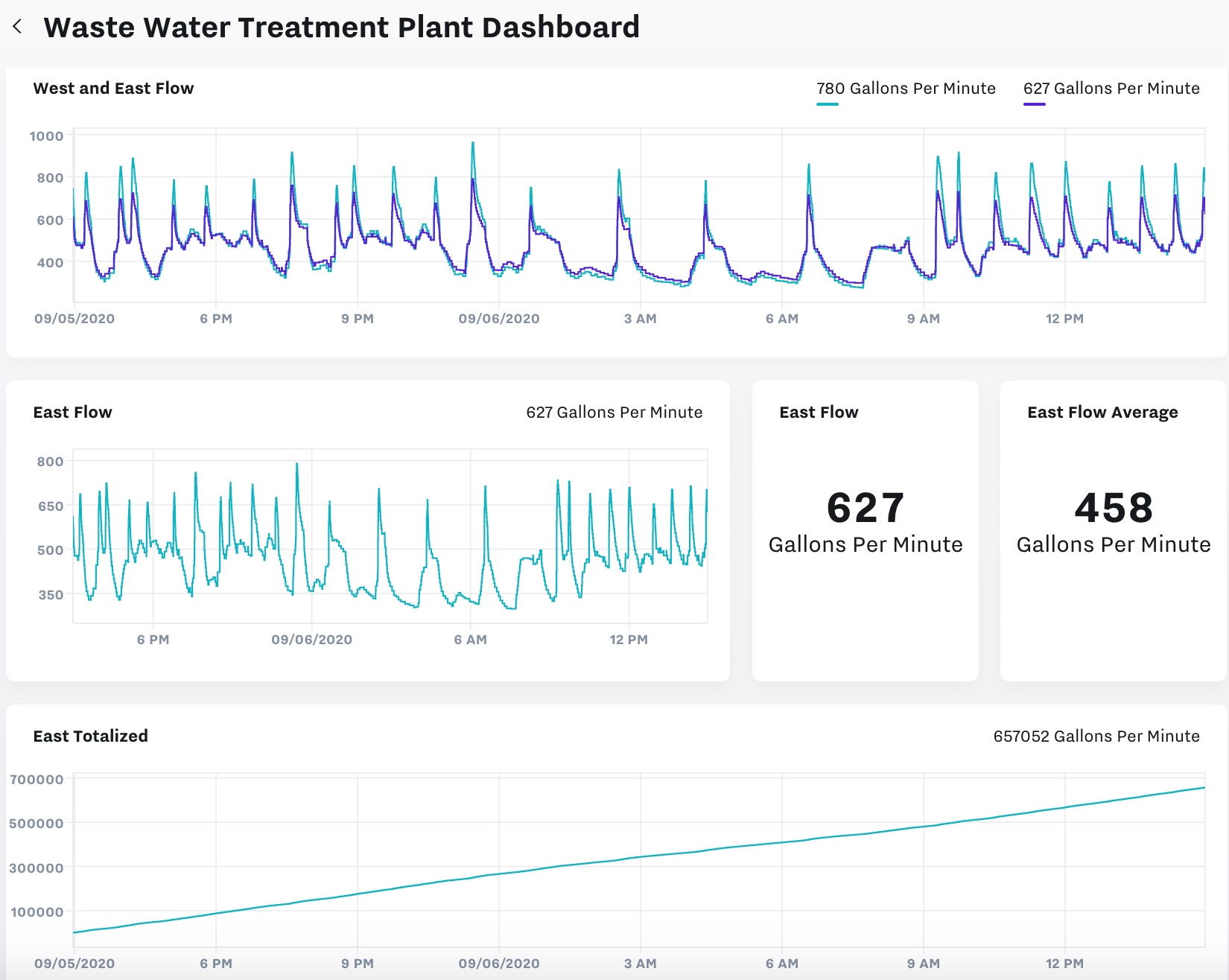
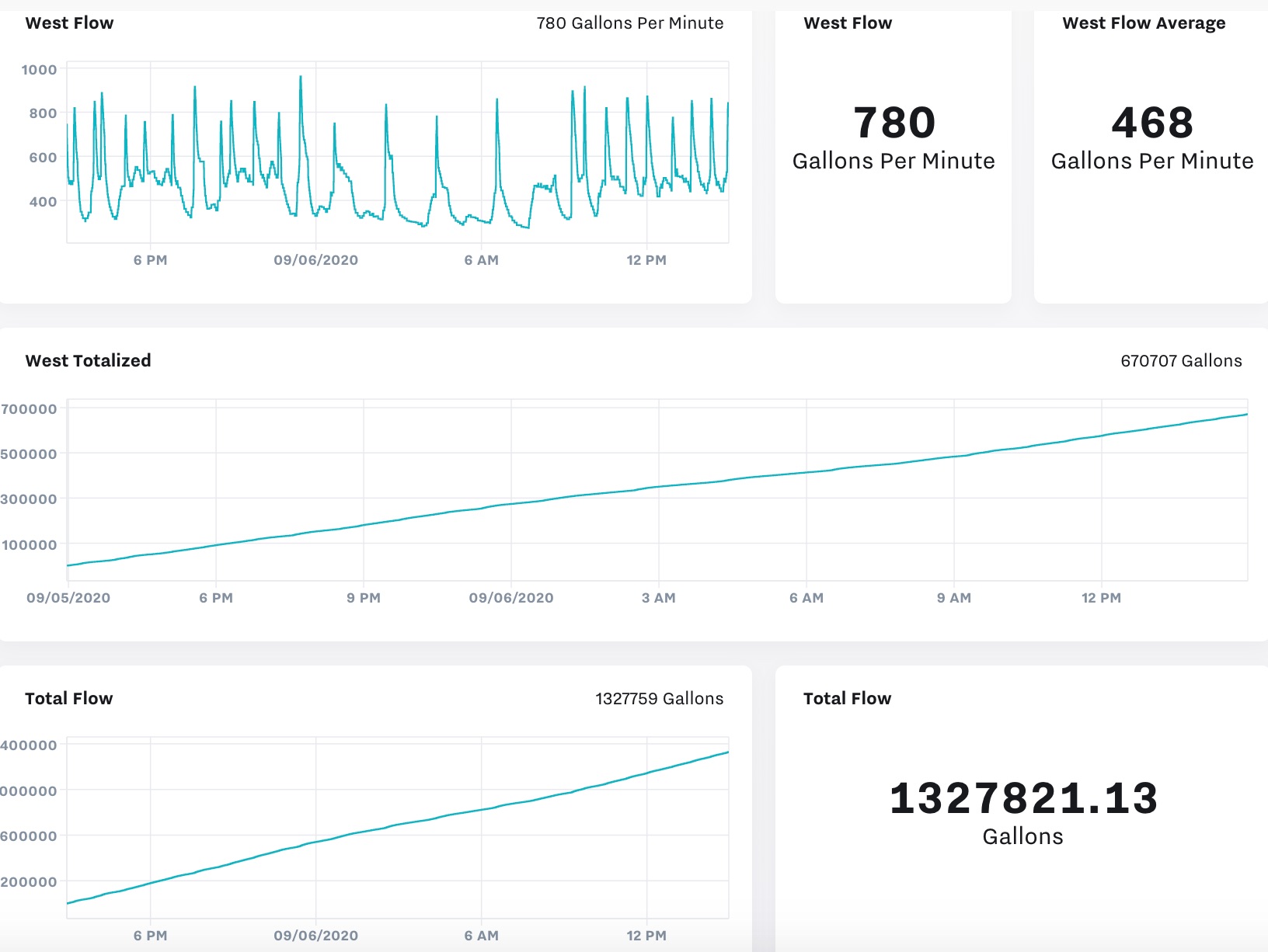
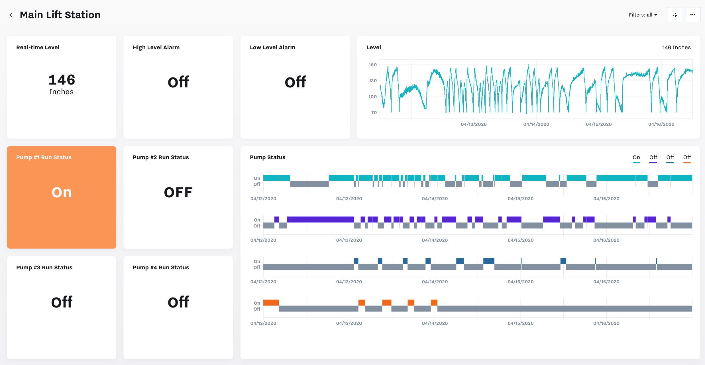
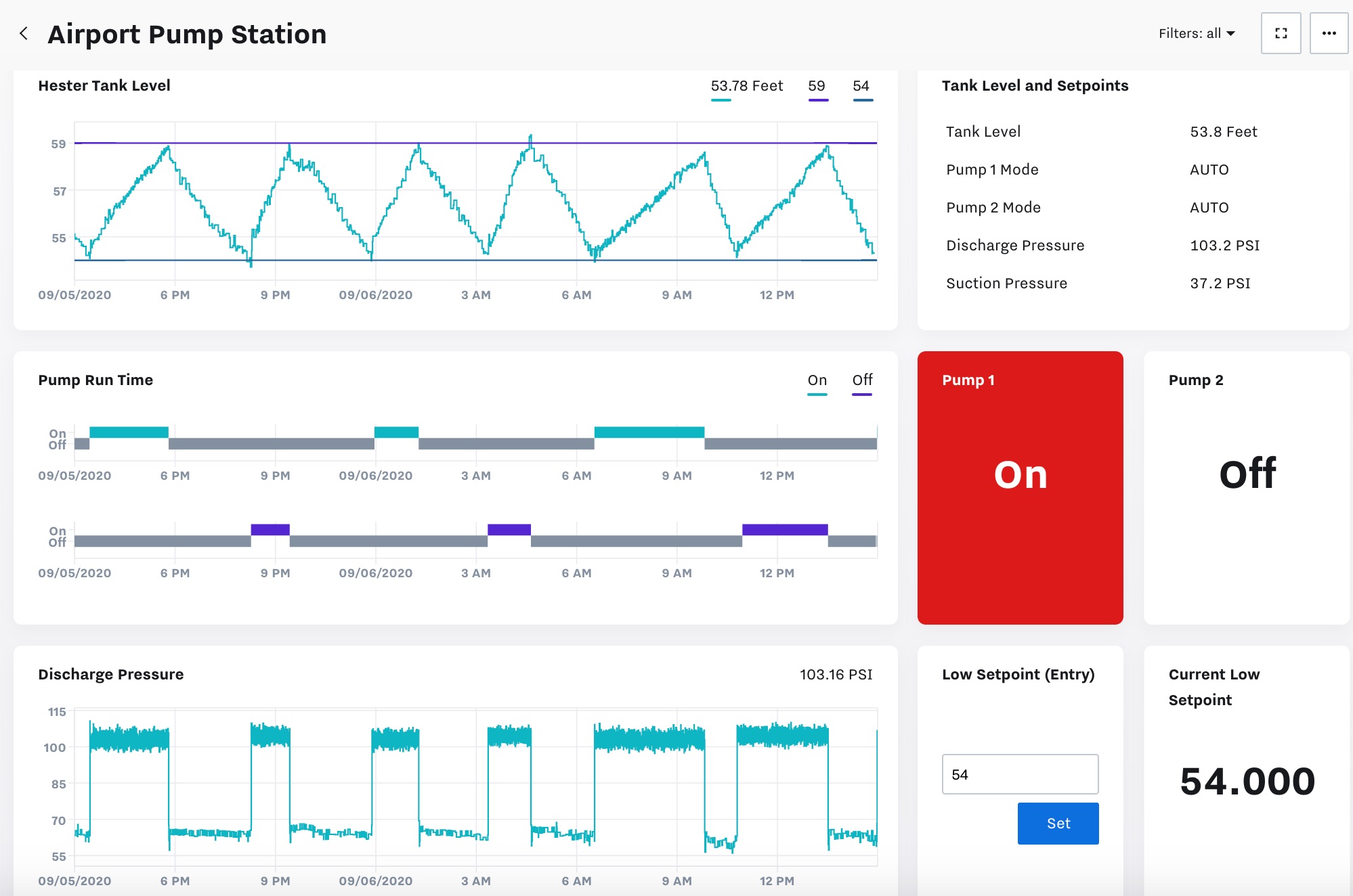
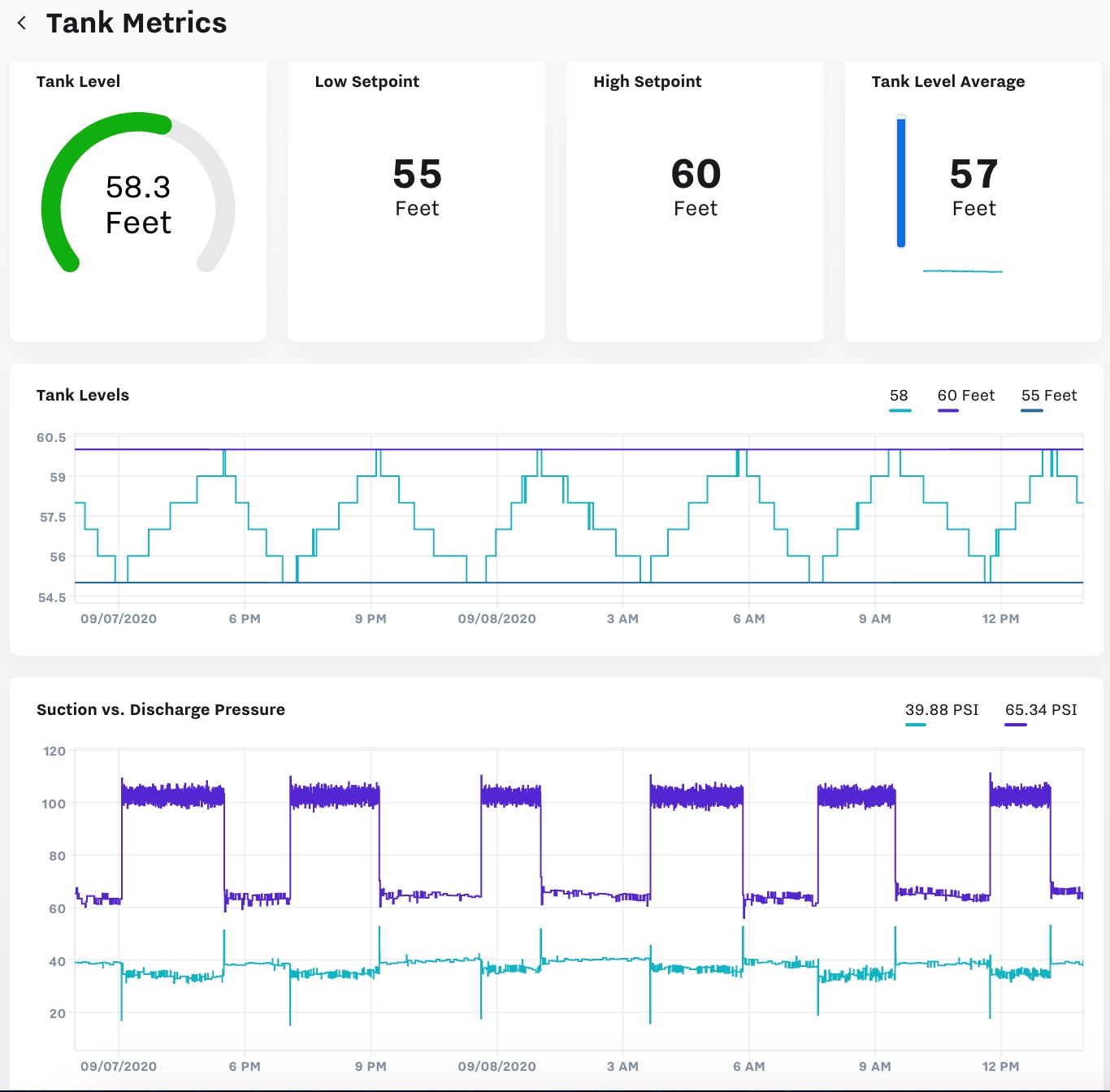
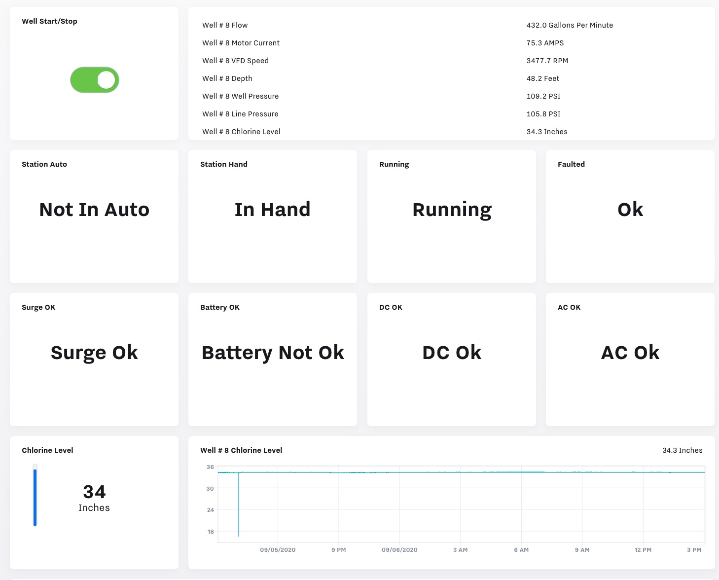
Example KPI Dashboards
Water / Wastewater
Rentals / OEM / EaaS
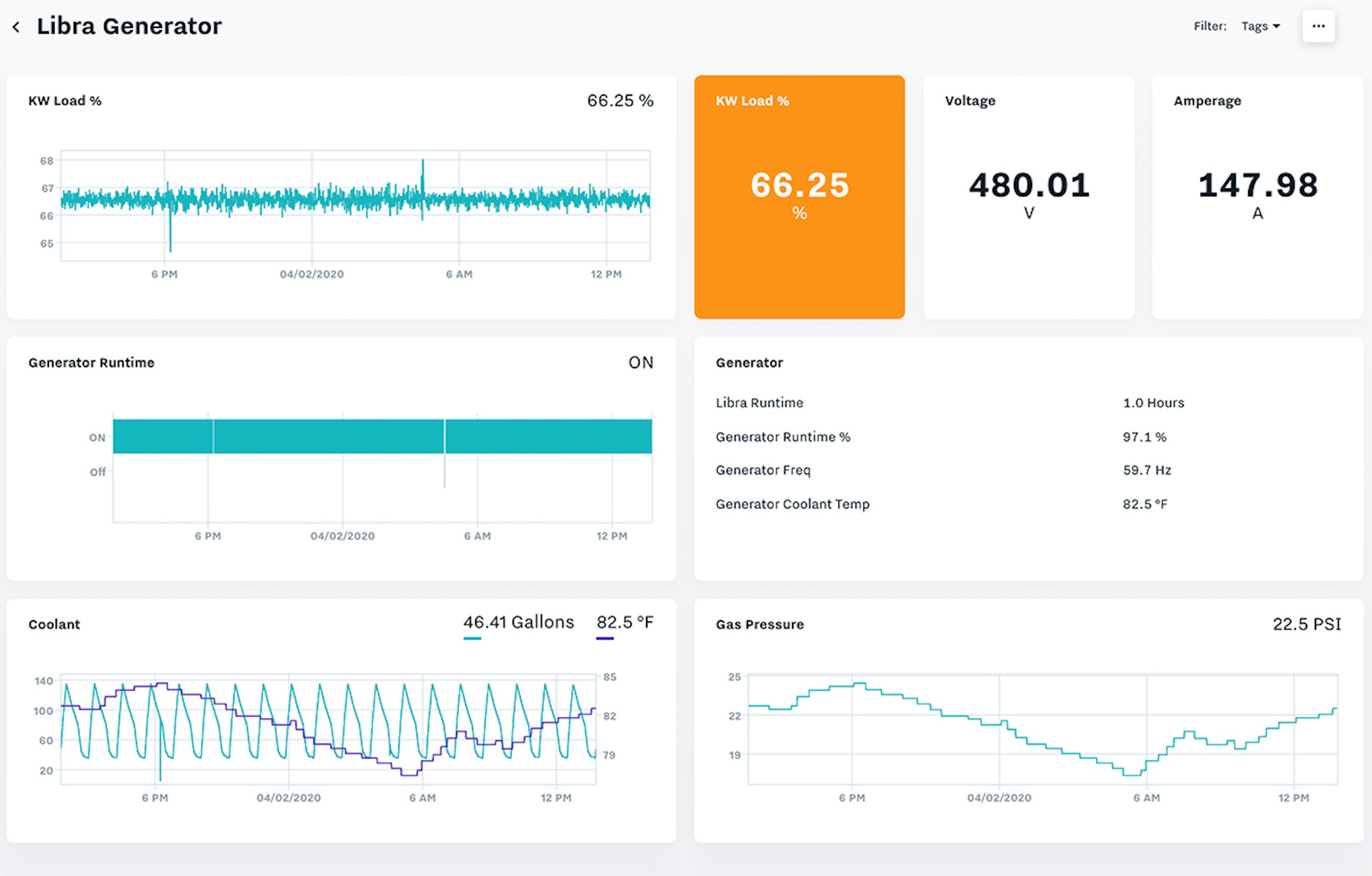
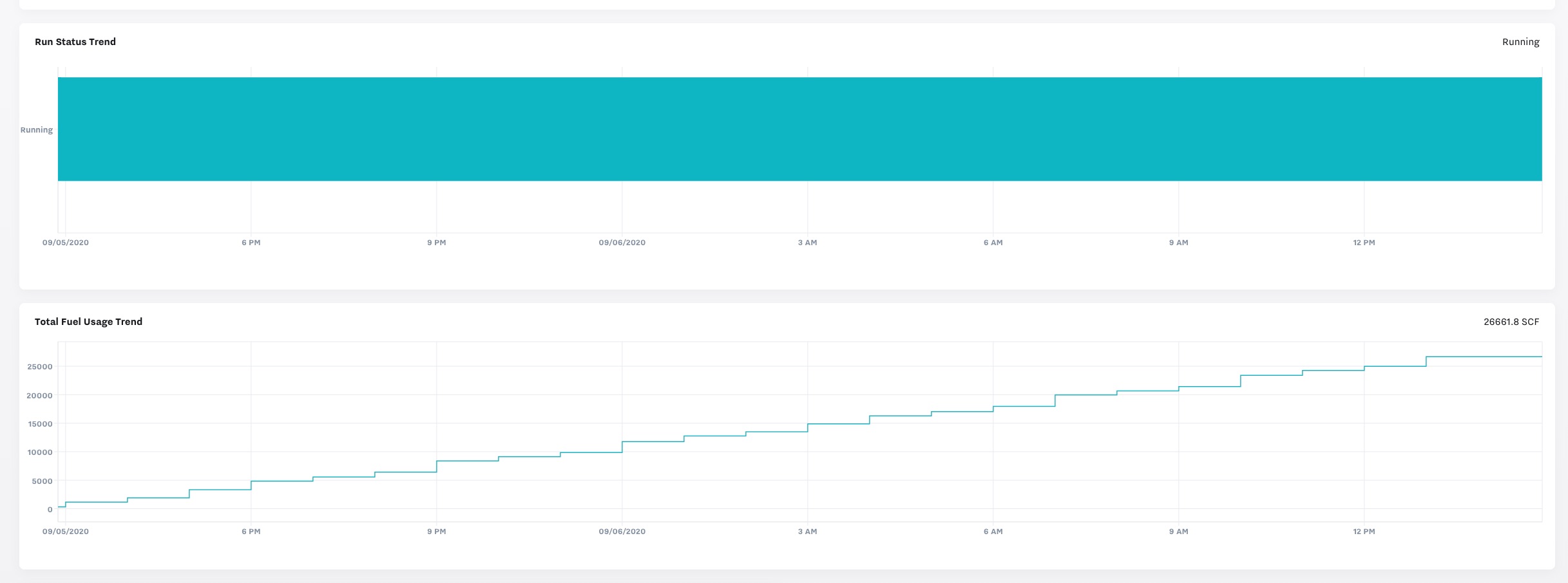
Oil & Gas